
Mobilegeddon – Ultimate Survival Guide
April 21st’s mobile-friendly update provides a new approach to rankings for the search on mobile devices. Users are now able to find more relevant results with readable texts, more convenient tap targets, and without horizontal scrolling and unplayable content. Is it a revolution? How does the update affects overall search? How to survive under the new conditions? Below we provide answers to this and others questions about Mobilegeddon – Google mobile friendly update.

First of all we recommend you to check the official mobile-friendly test by Google. Hit the below link to find out if your website meets the requirements.
To avoid unnecessary questions, you should know 3 major features of Mobilegeddon: 1) it affects search rankings on mobile devices ONLY; 2) ALL languages are affected; 3) the update has influence on individual pages ONLY, while entire websites stay aside.
At the same time desktop sites can still affect mobile ranking. For instance, desktop sites with high performance provide positive impact on ranking of slow but mobile friendly websites.
The good thing about Mobilegeddon is that you don’t have to wait for the new update, once a page on your website is mobile-friendly. There are 2 possible ways to get better rankings. First of all you can wait until Googlebot for smartphones will visit your site. It will recrawl and index the new mobile-friendly page. The second opportunity to tell about your mobile-friendly pages is to use , which is faster than waiting for Googlebot to come. The process lasts from a few hours to several days. In a case of large sites, receawling and new indexing can take up to one month.
Another important aspect of Mobilegeddon is the equal approach to responsive web design, dynamic serving, and separate mobile URLs. All this methods of mobile-friendliness get the same rankings. And even if your pages are not mobile-friendly, chances are, they will not disappear from search results due to a high quality content. But it doesn’t mean, that you should keep your website desktop-only. Remember, that the update rolls gradually, so if your desktop-only website still has good rankings, that could be just because of slow course of events. In a case when user is looking for the certain brand, but this brand still doesn’t have a mobile-friendly website, it also gets the first position among other search results.
Of course, Mobilegeddon is not perfect, and there can be problems even with mobile-friendly sites. For example, they fail to pass the Mobile-Friendly Test. The most common reason is a block, which stops Googlebot from crawling CSS and JavaScript. As a result, Googlebot cannot determine if pages of the site are mobile-friendly. Luckily, Mobile-Friendly Test shows if there are blocked resources on your website. If the problem is in blocks, you should provide Googlebot with the access to the necessary files. Use the aforementioned official method to submit your new robots.txt file to Google and run the new Test. For other questions, check this .
Device Mode is another necessary tool for the creation of a mobile-friendly website. We all know that web content should look great across all possible devices, and Device Mode makes this easier by making mobile testing accessible right in your browser. It provides you with the almighty power of mobile emulation. As a result, you are able to emulate all possible screen sizes and resolutions while testing the responsiveness of your mobile website. In addition, you get the network emulator, designed to check the performance of your site. There are also tools for testing CSS media queries in the Device Mode. Last but not least are different tools for simulating device orientation, touch events, and geolocation. Keep in mind, that you can always combine Device Mode with DevTools. You can find the detailed description of Device Mode and Mobile Emulation .
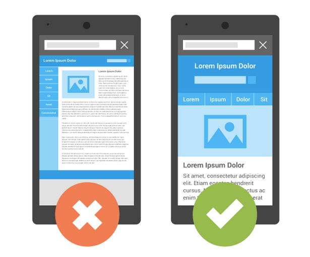
It is also important to understand, that partially mobile-friendly page is a nonsense. According to Google, web page can be responsive or not, so always use the Mobile-Friendly Test to check the responsiveness of your mobile website.
Table of contents
- How to check the responsiveness
- What mobile optimization approach should I choose?
- What are the common mistakes? How can I avoid them?
- Mobilegeddon & E-Commerce
- How to survive under the new conditions?
- Early Consequences Of Mobilegeddon
- How To Make Any Website Mobile-Friendly
- Plugins for WordPress
- Mobile website builders
- Mobile-Friendly Web Development From Scratch
- Mobile-friendly website builders
- How to create a responsive website from scratch
- Impact Of Mobilegeddon
- External Links
How to check the responsiveness
- Open Mobile-Friendly Test in your browser.
- Enter the URL of your web page.
- Hit the Analyze button.
- Get the results.
If the web page is mobile friendly, you will see the message like this one:
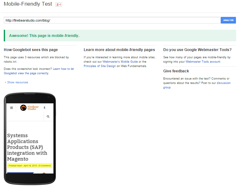
Mobile-Friendly Test
In addition to the success message, you will see, how Googlebot “sees” the page. It can be different from its original responsive view because of robots.txt file (as mentioned before, it can block Googlebot from recognition of page as mobile-responsive).
If the page isn’t ready for the Mobilegeddon, you’ll get the failure message that lists problems and provides recommendations.
What mobile optimization approach should I choose?
To survive under the new conditions, you should choose one of the following approaches to mobile-friendliness:
1) Responsive Design
As mentioned before, all three approaches are equal, but Responsive design is recommended by Google. This pattern doesn’t require the creation of two copies of the same website. As a result, there is only one URL, which is much more convenient for the visitors, as they move between different devices. The HTML file is also the same.
2) Dynamic Serving
This approach provides you and your visitors with one URL, but unlike the responsive design dynamic serving requires the different HTML for mobile-friendly website. User-agents sniff out what devices are used by the visitors to provide them with the appropriate view. Keep in mind, that such approach is associated with errors, but it helps to pass the test.
3) Mobile Website
This approach to mobile friendliness is the oldest one, but it still works. You need to create two separate websites and redirect your mobile users to the appropriate one. The biggest drawback is the accidental clicking on the mobile link, which leads users to the mobile version of the website while they are on a desktop device.
As you can see, the responsive design provides the best approach to mobile friendliness. Visitors really like it, as it is seamless – there is only one URL and only one HTML. Googlebot has much less work while crawling it – Google indexes more content within the same time. And it requires less time and effort for developers to provide visitors with a responsive website. It is also important, that without redirection mobile-friendly website works faster.
What are the common mistakes? How can I avoid them?
Making your website mobile friendly, you should avoid the . To do this, follow the below advices:
-
Don’t block Googlebot from the access to JavaScript, CSS and image files.
-
Remove all unplayable content.
-
Check your site for the redirect errors (in case of a separate mobile version)
-
Fix the 404 error.
-
Use the right ads – avoid using interstitial ads.
-
Fix errors in cross links.
-
Enhance the page load time.
-
Additionally, you should ensuring that the size of your fonts is big enough for mobile devices.

Common mistakes at Google Developers
Mobilegeddon & E-Commerce
Google is constantly trying to provide its users with the best possible experience. While the popularity of mobile devices is growing, the company develops new standards for business owners and their websites. If a site meets the new requirements, it gets high rankings and therefore better conversion. Of course, e-commerce is not the exception.
A positive result in the Mobile-Friendly Test is extremely important for every e-commerce site, as every year the number of mobile shoppers grows. Better ranking leads to more robust traffic and higher conversion rate. Thus, revenues from e-commerce activities grow.
The impact of Mobilegeddon on e-commerce website depends on two things: the percentage of visits and sales done via mobile devices versus overall visits and sales; the percentage of brand keyword to other keywords in overall mobile traffic.
If your web store isn’t mobile-friendly, a significant percentage of your customers uses mobile devices, and they get on your e-commerce website without using brand keywords associated with your business, then you will lose an appreciable part of your traffic and, as a result, revenue – this is the worst case scenario.
If your e-commerce website is mobile friendly, and your competitors provide their users with desktop-only sites, then you will get a competitive edge over other market players, because your site will get the highest ranking. As a result, you will capture mobile visitors of your counterparts. This is the best possible example of Mobilegeddon influence on e-commerce.
The situation will remain the same if your e-commerce store doesn’t have mobile visitors at all, or they use only brand keywords associated with your business, while trying to get to your website.
Most e-commerce giants are not mobile friendly, so both big and small websites are going to be affected by Mobilegeddon. 40% of 25,000 largest websites in the world doesn’t provide their mobile users with proper experience, but they are less vulnerable because of high percentage of brand keywords in a search results. Appropriate content still remains the key to effective SEO, but mobile-friendliness enhances its influence on e-commerce.
The problem is that e-commerce stores don’t provide this content. Online retailers often copy the content from other sites. In this situation, mobile-friendliness remains the key aspect of mobile traffic.

Mobilegeddon & E-Commerce
How to survive under the new conditions?
1. Improving the mobile experience of your e-commerce store
Provide your visitors with mobile-friendly interface. Keep in mind, that your site should not only look good on small screens, it should also reduce the number of actions your mobile visitors perform while on your e-commerce site. Reduce the page load time as much as possible (Ideally, it should be less than a second). Add deep linking to your mobile applications. Optimize your e-commerce store for mobile assistants. For example, focus on Google Now. It is also necessary to work with Knowledge Graph. Well-placed CTA button, social autofill, minimalism and necessary content, mobile-friendly Web forms will help you on your way to mobile-friendliness.
2. Provide the additive experience for your mobile users
E-commerce has wide opportunities on mobile devices. GPS, cameras, microphones can be used to provide your mobile users with unique additional features. Google relies on this technologies to allow things impossible in a case of desktop experience. Search results based on GPS data, extend use of voice search, Google Goggles, and other features are unique to smartphones. Try to adopt them to your e-commerce business, and you will be ahead of your competitors. Of course, it was clear even before April 21st, but now we can see that Google pays more and more attention to its mobile users. Mobilegeddon is the biggest evidence of this process. Even if the new conditions don’t affect your e-commerce business, go up with the time. Chances are, a mobile-friendliness will lead some additional traffic to your site. It is also obvious, that Google is going to implement new rules in order to provide its users with better experience. Thus, you should predict the future and reinsure your e-commerce business today.
Early Consequences Of Mobilegeddon
According to Hivemind, the consequences of Mobilegeddone are very substantial. The new searching paradigm somehow affects 60% of the busiest websites due to failed mobile strategy. During last 3 years Google has been recommending mobile-friendliness, but only now the company decided to punish those websites which ignored the new trend.
Among 2 million sites, only 20% provide their users with responsive design. 16% provide mobile users with different content with 10% using mobile subdomains. The number of sites which rely on app index is even lower.
E-commerce mobile strategies
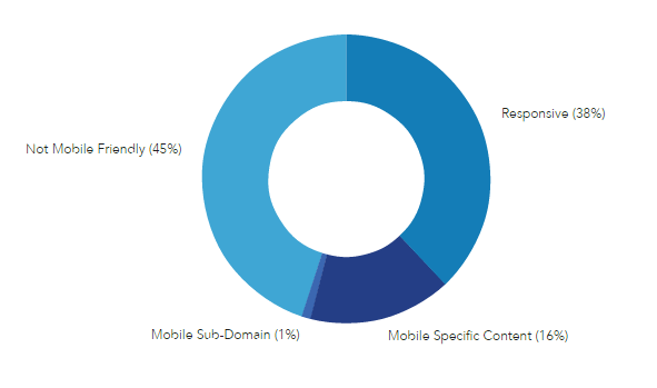
Such situation affects e-commerce revenues most of all. But e-commerce websites take leading positions when it comes to mobile-friendliness. Still 45% of e-commerce stores are not mobile-friendly. 1% rely on mobile subdomain, while mobile specific content is delivered by 16% of websites. Responsive design is used by 38% of e-commerce stores.
As you can see, 55% of online stores provide their users with proper mobile experience. Their attempts to optimize the conversion rate has lead to such results. Of course, the real consequences of Mobilegeddon will become apparent only in nearest weeks or months. Now, it is obvious, that mobile friendly sites will provide their visitors with better experience, while others will try to implement mobile-friendliness. Without doing so they have all chances to lose a part of their traffic.
How To Make Any Website Mobile-Friendly
In this part of the article we gathered different tools for making every website mobile-friendly. You can also check our guide to responsive design.
Plugins for WordPress
It is possible to make any WordPress website mobile-friendly with the help of plugins. Below you will find the most robust solutions.
JetPack
JetPack is a package with 30+ features. It not only makes your site mobile-friendly, but also provides you with verification tools and integrates your site with Google+. Core features of JetPack include support for contact forms, сarousel for galleries, custom CSS, etc. There is also a possibility to customize the mobile theme, but you should have at least basic experience in CSS and PHP. And you can download JetPack for free.

JetPack
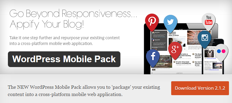
WordPress Mobile Pack
The second version of WordPress Mobile Pack plugin provides you with the ability to turn your website into a mobile application. Thus, your site will support various platforms and devices. The core features of WordPress Mobile Pack include responsive design, cross-platform access, and post synchronisation. The plugin supports customization of appearance. In addition, you also get analytic tools.
WordPress Mobile Pack
WP Mobile Detector
WP Mobile Detector also make your WP site mobile-friendly. It detects devices of your visitors and provides them with compatible mobile themes. WP Mobile Detector supports more than 5 thousand devices. In addition, you get advanced analytics tools. With premium version of this plugin, you will be able to build custom themes. WP Mobile Detector costs $50.

WP Mobile Detector
WP Mobile Edition
This plugin adds a mobile version of the existing website. Supported platforms include Android, iOS, and Windows. WP Mobile Edition detects mobile devices and provides visitors with the ability to switch to the version they need. The mobile-friendly website is fast and supports such features as smart formatting and commenting system. With the plugin, you can use 8 color schemes and mobile ads. WP Mobile Edition is SEO-ready.
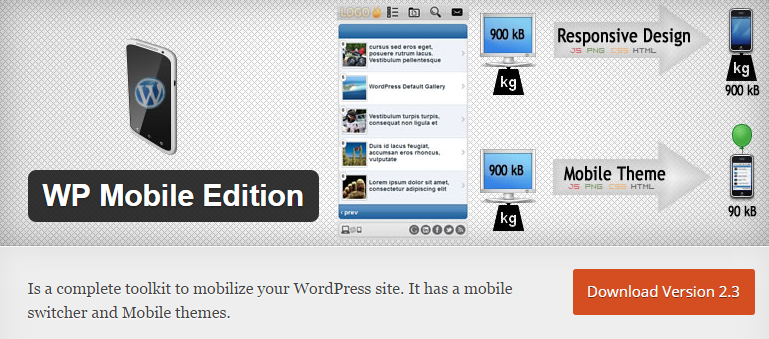
WP Mobile Edition
WPtouch
This plugin is used by 5+ million blogs. It includes a WPTouch Theme and a crisp retina interface. WPtouch relies on mobile caching to provide enhanced performance (Infinity Cache feature). It uses CSS to optimize images for all possible screen sizes. The price of this suite starts at $49. There is also a premium version of WPtouch with lots of additional features.

WPtouch
MobilePress
MobilePress is another plugin designed to provide your visitors with proper mobile experience. It renders a new version of WordPress-based website, which is mobile-friendly. There are only two themes and basic features provided by MobilePress. Developers are also able to create their own themes based on the platform.

MobilePress
Wapple Architect
With this tool, you will get a mobile-friendly website within several minutes. Wapple Architect fixes on every mobile device to provide it with proper look and feel. Unlike previous solution, this plugin adds lots of features to the WordPress blog, so you can customize mobile experience as you wish. Wapple Architect doesn’t use mobile themes. Instead, it relies on the design of desktop site.

Wapple Architect
OBox Mobile
With Obox Mobile, your WordPress website will become mobile-friendly within all modern Android, iOS, and Windows devices. The plugin is extremely easy to use – you just have to plug it to your blog and to choose a color scheme among 5 possible solutions. Obox Mobile includes such features as post slider, buttons for social media, adverts, etc.

OBox Mobile
Mobile Solution by iThemes
Besides mobile-friendliness, iThemes plugin provides your website with the following features and tools: style manager, custom header uploader. iThemes relies on separate themes and navigation menus for different mobile platforms. The plugin costs $45. This is the basic price.

Mobile Solution by iThemes
Mobile website builders
You can also use mobile website builders to make the existing website mobile friendly. Solutions, mentioned below, are suitable for all possible platforms and websites.
Mobify
Mobify is a platform which integrates into the e-commerce website and makes it mobile-friendly. It work like an analytics tag – connects to the store without affecting any other software. Mobify relies on experience management tools to transfer e-commerce capabilities into mobile platform. In addition to mobile-friendliness, the it provides features based on such elements of modern mobile devices as cameras, touch security, push notifications, NFC, mobile payments, etc. Mobify is based on a global distribution network, so it works worldwide.

Mobify
MoFuse
MoFuse is a mobile website builder designed to create mobile friendly sites in just a few minutes. You can even let experienced designers to do all the work instead of you. Websites created with the help of MoFuse are SEO-ready – they get right keywords, proper content, and good indexing. In addition, you receive advices about social web presence. MoFuse also provides the ability to implement SMS text message marketing.

MoFuse
WompMobile
WompMobile is another platform, which turns desktop site into mobile-friendly. The new website is responsive within all platforms. Both versions are synchronised and have the same URL. WompMobile automatically compresses and optimized all images according to the requirements of every device. The platform provides high performance, extra customization, and complete integration with the desktop site. Additionally, we should mention that WompMobile is a secure solution, which uses CDN.

WompMobile
MobilizeToday
This mobile website builder is highly customizable and easy to use. You just enter site’s URL and hit the button. There are several ways the website can become mobile friendly. You can choose elements necessary for the mobile version of the site, change the order of blocks, and customise HTML, CSS, JavaScript. To check the readiness, you can scan the appropriate QR code with your smartphone.
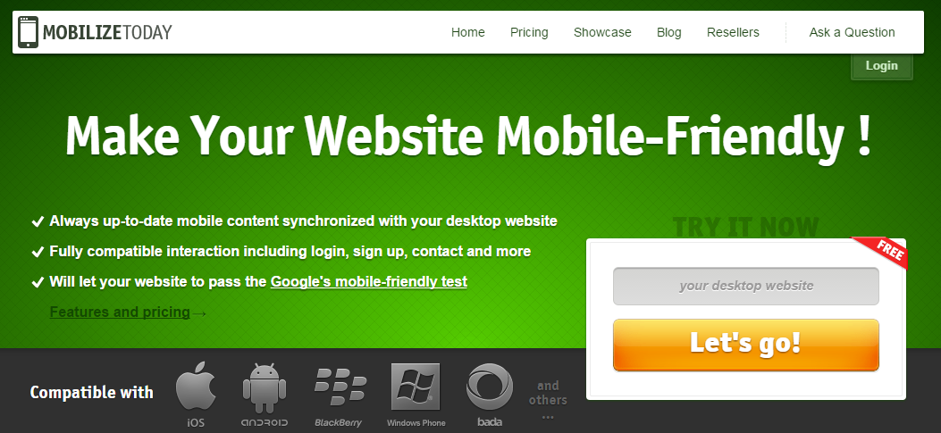
MobilizeToday
Duda
Duda is another company that provides a software for making mobile-friendly websites. Its products are designed for both small and medium-sized businesses. Duda provides all necessary tools for creating and publishing mobile-friendly sites. This mobile website builder relies on two separate approaches to mobile-friendliness. Users can create a responsive website based on a desktop website with the same URL, or design a new mobile site, which can be customized with the help of a drag-and-drop editor. Both variants are compatible with all mobile devices. They are equipped with analytics tools and support synchronization with desktop counterparts.

Duda
Wannabemobile
Wannabemobile is another reliable solution for turning a desktop-only website into a mobile friendly one. With the help of this platform, you will can create a separate mobile version of the existing website, or make it fully responsive. As a result, your visitors will be able to find your e-commerce store or blog from any mobile device. In addition, you will get enhanced performance and better SEO. Wannabemobile offers a friendly pricing for its services. Hit the below link for the additional information.
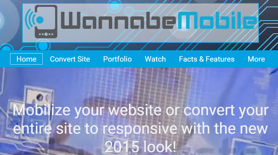
Wannabemobile
bMobilized
This mobile website builder is used by 3+ million websites. bMobilized relies on unique algorithms to create a new version of the existing website, that will be suitable for all possible screen sizes. You just have to enter the URL and wait for the result. If something in the mobile interface looks wrong, you can always fix it. There is also a possibility of full customization.

bMobilized
Convert 2 Mobile
Convert 2 Mobile is another platform which will help you convert your desktop-only website into mobile friendly. This mobile website builder combines top notch functionality with simple setup and great design. With this platform, you can create unlimited number of content, such as pages, galleries, events, etc. There are also a shopping cart support, social media integration, and lots of other useful features provided by C2M.
Mobile-Friendly Web Development From Scratch
If you are going to create a website from scratch, then you can use an appropriate website builder. You will find the best solutions with the support of mobile-friendliness below, and don’t forget to check the review in our blog.
Mobile-friendly website builders
Webflow
You don’t need to be a professional coder to create a modern mobile-friendly website. With the help of Webflow, this task is feasible for everyone. The website builder generates a clean code as you create a design. The platform creates a valid markup and style sheets. It automatically adds special code to provide the websites with cross-browser support. There is also an access to code for deeper customization. The intuitive interface of the platform turns routine processes into fun. As a result, you can get the responsive website with ease.

Webflow
Macaw
With Macaw you will forget about headaches of coding. This website builder provides you with the ability to draw your site instead of writing code. Macaw has several system fonts and at the same time supports web fonts and lots of different styles. The platform relies on variable names and scripts to enable fast prototyping. All Macaw-based websites are responsive, and you can check the readiness of this feature with the remote preview. In addition, you can share assets between pages, save different components in a library and use them with other websites.
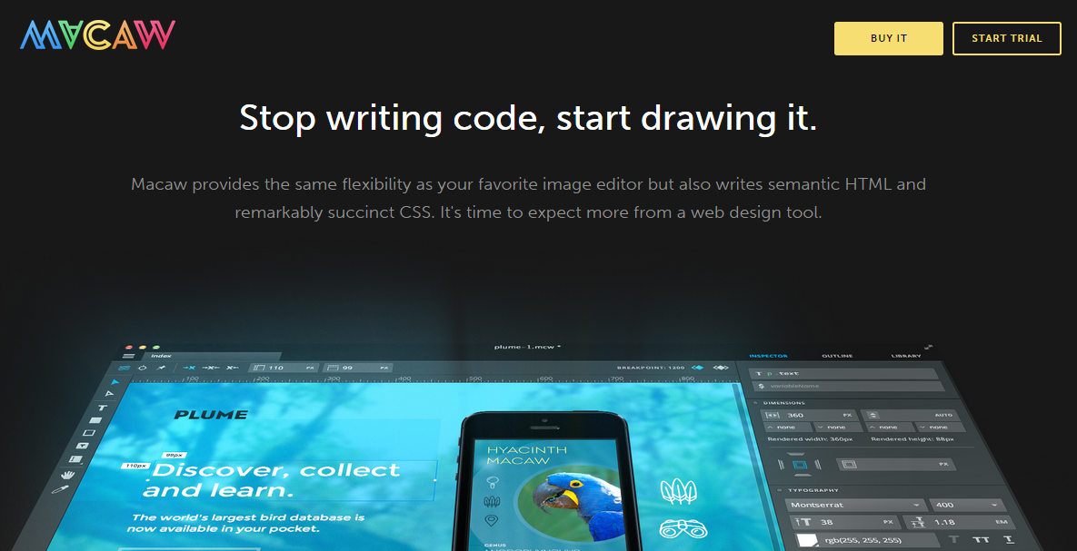
Macaw
Mobile Web America
Mobile Web America provides several tools for web development. First of all, you can use the platform to create a mobile-friendly website from scratch. There is also a possibility to make the existing desktop-only website responsive, or create a mobile website from scratch. Hit the below link for more detailed information.

Mobile Web America
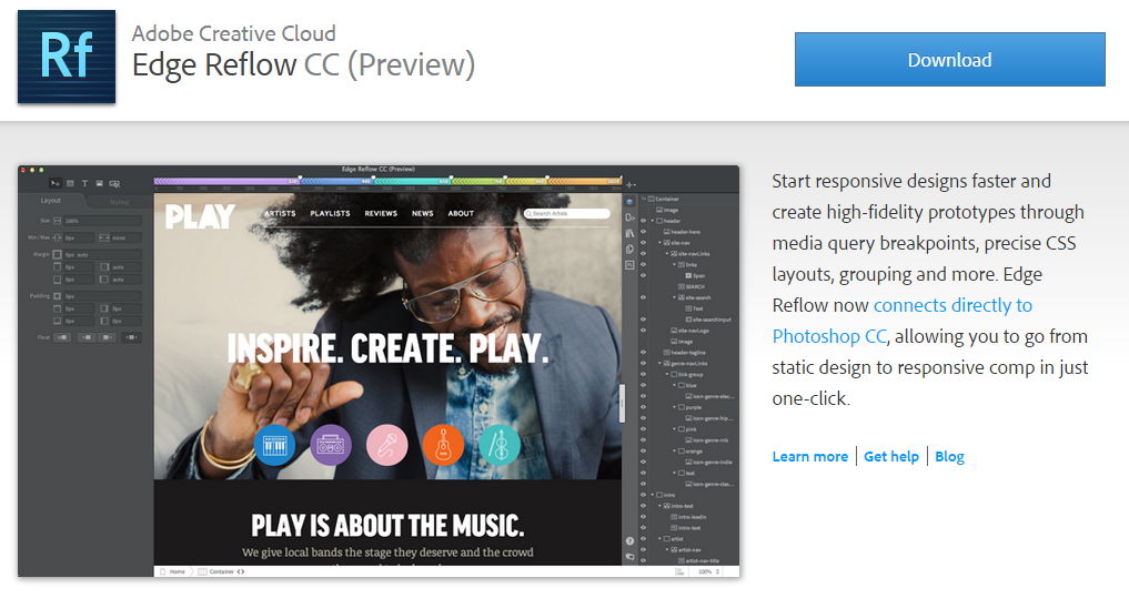
Edge Reflow CC
Edge Reflow CC is a part of Adobe Creative Cloud. This is offline solution, so you should download and install it on your computer. Creating responsive websites with Edge Reflow CC, you will be able to get high-fidelity prototypes with ease. Media query breakpoints, grouping, CSS layouts will help you to achieve your goals. Last but not least is the integration with Photoshop CC, so you can go from static to responsive design within one click.
Edge Reflow CC
Froont
This is another website bulder which is good at creating responsive websites. Froont supports CSS import from Photoshop and smart code export. The other useful features are responsive layouts, percent based grids, real testing environments, ability to copy the project, etc. The site of the company is made with Froont, which is a good demonstration of what this platform can do.

Froont
How to create a responsive website from scratch
Preparation
To create a responsive website, we will use a CSS framework. Check our post about the best CSS frameworks to get better understanding of the tool. In this tutorial we will use Foundation. You can also check our guide to front-end development to know more about creating modern websites.
Foundation
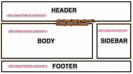
First of all you should understand how Foundation works. It relies on 12 columns structure to define the width of the website sections. Use div “class=”row”” and div “class=”number of columns”” to show how much space the certain number of columns with the width of 1000px will occupy in the certain row.
Layout
Create an index.html file and add the following code:
|
1 2 3 4 5 6 7 8 9 10 11 12 13 14 15 16 17 18 19 20 21 22 23 24 25 26 27 28 29 30 31 |
<!-- Rean's note: if you're wondering what are these items below, you should follow the link below --> <!-- paulirish.com/2008/conditional-stylesheets-vs-css-hacks-answer-neither/ --> <!--[if lt IE 7]> <html lang="en"> <![endif]--> <!--[if IE 7]> <html lang="en"> <![endif]--> <!--[if IE 8]> <html lang="en"> <![endif]--> <!--[if gt IE 8]><!--> <!--<![endif]--> <!-- Set the viewport width to device width for mobile --> Welcome to Foundation <!-- Included CSS Files --> <!--[if lt IE 9]> <link rel="stylesheet" href="stylesheets/ie.css"> <![endif]--><script type="text/javascript" src="javascripts/modernizr.foundation.js"></script> <!-- IE Fix for HTML5 Tags --> <!--[if lt IE 9]> <script src="http://html5shiv.googlecode.com/svn/trunk/html5.js"></script> <![endif]--> |
and this one
|
1 2 3 4 5 6 7 8 9 10 11 12 13 14 15 16 17 18 19 20 21 22 |
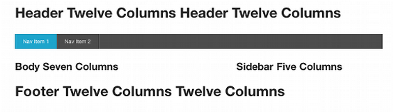
<div class="row"> <div class="twelve columns"> <h2>Header Twelve Columns</h2> </div> </div> <div class="row"> <div class="twelve columns"> <div class="row"> <div class="seven columns"> <h3>Body Seven Columns</h3> </div> <div class="five columns"> <h3>Sidebar Five Columns</h3> </div> </div> </div> </div> <div class="row"> <div class="twelve columns"> <h2>Footer Twelve Columns</h2> </div> </div> |
You should get the following result:
Now you have basic one-page responsive website. Use the to learn what to do with other elements of the site.
Content
To fill your site with the content, add some text to “body” div, and use <img> tag to insert images.
Of course, this was only a basic tutorial, but it is good for the beginning. Below, you will find links to more complicated guides and useful resources.
Impact Of Mobilegeddon
Both small and medium businesses have experienced the strongest impact of Mobilegeddon. Thanks to Koozai, we know the following: among 2 thousands businesses with 50 or less employees, 46% have faced with the ranking drop between 3 to 50 percents.
Even a small change in ranking had a big negative impact on organic mobile traffic. Below we will explain how to identify the impact of Mobilegeddon.
First of all, you have to set up a report:
- Open Google Search Console.
- Go to Search traffic and choose Search Analytics. For mobile websites on a separate subdomain, there is a separately account.
- Choose Clicks
- Don’t use any filters with Pages
- Choose your country beneath Countries
- Set Mobile beneath Devices
- Your Search Type is Web
- Now you should set the parameters under Dates. Choose Comparison and Custom to set two intervals: one month before Mobilegeddon and a month after.

Congratulations! You have a report showing the impact of Mobilegeddon on your Website. If there were less clicks during the month after the Google’s update, your site experienced a negative impact. If the number of clicks increased, the impact was positive. Chances are, that you’ve got the traffick of your unlucky counterparts.
Now you can easily check, what pages are the weakest / strongest. By click on the Difference column header, you will sort them in an appropriate way.
Find the weakest URL. With the help of Queries, you can find out the problematic keywords (related to the loss of clicks). Utilize the header of Difference column as in the above example.
Now you can set a specific query of interest to find out if the problem is really in Mobilegeddon.
Note, that the decreased number of click doesn’t mean that the mobile update is the only reason of problem. Chances are, that before Mobilegeddon there was a bump in traffic due to various reasons. This was a single case event, so the number of clicks after the Google’s update decreased, but due to unrelated reasons. Compare Clicks with Position and Impressions to be sure, if Mobilegeddon is a true reason of your headaches. You should also analyse traffic for both mobile and desktop devices to find out the influence of Mobilegeddon on your website.
External Links
First of all check the at Google Developers. You will find a lot of useful tips and advices there. Google always knows what to do with the website to make it mobile-friendly.
There is also a good . The author uses practical examples to illustrate how to use Sketch to create responsive website. Sketch is a tool for creating professional digital design.
at User Testing provides the ultimate list of responsive web design resources. There are 44 sources divided into 11 categories. In the article you will find links to the best books, podcasts, blog posts, online courses, templates, tools, and other useful materials.
Tuts+ also has an article about responsive web design. The author describes the current state of RWD and shows all its aspects. Hit to get the detailed information about responsive web design.
If you cannot imagine your study without books, then you should check . The author tells about 7 most important books about responsive design.
Related posts
 New in Shopware 6 Product Import: Control Topseller Products with the markAsTopseller Field
 Magento 2 Bundle Product with Custom Options: Complete Guide to Benefits, Limits & Import
 Shopify Product Import Behavior Explained: Take Full Control of Your Product Data
 Automatic Parent Product Creation: Smarter Shopify Imports for Cleaner Catalogs
 Shopify PHP Data Transformation on Import: Automate Price, Inventory, and Other Adjustments with Custom Scripts
 How to Import Products to Shopware 6 & Automatically Assign Them to Parent Categories: A Time-Saving Import Feature You Shouldn’t Miss
 Take Full Control over Product Visibility in Shopware 6: Introducing the ‘Replace Product Sales Channels’ Feature for Import
 Magento SEO in 2026: Proven Strategies to Rank Higher and Boost Sales (50+ Tips)