How To Make Every Magento Store Responsive And Mobile Ready
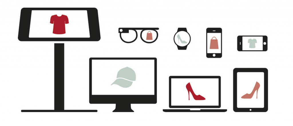
Responsive design is a special approach to web design aimed at crafting sites to provide an optimal viewing experience for mobile devices. Responsive web design provides easy reading and navigation, and reduces resizing, panning and scrolling to minimum.
The technology relies on proportion-based grids with page element sizing in percentages, flexible images sized in relative units, and CSS3 media queries, which allow the page to use CSS style rules, based on characteristics of every single device. But why is Responsive design so important for e-commerce?

According to Shopify, mobile accounts for over the half of all e-commerce traffic – 50.3% by the end of August. The number is only true for Shopify platform, but the trend is relevant for other ecosystems. The biggest reason for this huge uptick is the constantly growing number of people equipped with smartphones and tablets. For example, 63% of U.S. consumers owned a smartphone by the end of the third quarter of 2013. The number of people, who use mobile coupons has increased from 7.4 million in 2010 to 29.5 million in 2012. Loyalty programs also play a key role in the process, being implemented in the form of mobile apps.

There is also the second important reason why Responsive design is very important for e-commerce sites. Computer-based traffic to e-commerce sites rises during a workweek and is interrupted during the weekends. Since shoppers use their mobile devices a lot during weekends, you can combine mobile and computer traffic to your e-commerce site to solve this problem.
By using Responsive design, you make your e-commerce store mobile friendly. As a result, you get extra traffic, more loyal customers, and possibility to increase the profit. To achieve this goal, you can use services mentioned below.
Table of contents
Shopgate
Shopgate is one of the most advanced toolkits for a successful mobile e-commerce business. The service provides websites for smartphones and tablets as well as apps for iPhones, iPads, Android phones and tablets. Native apps and mobile websites includes such features as push notifications, store locators, daily deals, barcode and QR code scanners. Shopgate works for all major e-commerce platforms. Pricing plans starts at $19 per month with the most expensive of them with a $499 price tag.
Tenfoot
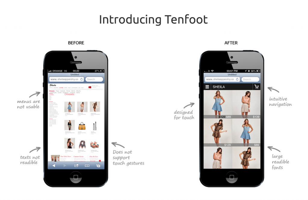
And this is one of the easiest ways to create a responsive version of your e-commerce store. With Tenfoot you will provide your online store with intuitive navigation, large reliable fonts and touch gestures support. The cheapest solution costs $29 per month, the most expensive – $219. With the premium plan you get a free setup, unlimited SKUs, unlimited visits per month, no transaction fees, an email+phone support, a web-app and a native app for iPhone. Tenfoot supports Magento Community edition 1.5+.
CouchCommerce

To make your Magento store fully responsive, CouchCommerce uses modern highly customizable open source web app technology. It can be used for mobile only or across different devices. CouchCommerce can work self-hosted or as a service on a special Enterprise SaaS platform. SaaS platform provides such benefits as constant updates, 3rd party integrations, scalability, support, SLA, and continuous optimization. The price consists of 30 euro cent per transaction and monthly service fee starting at €3000.
Mobify
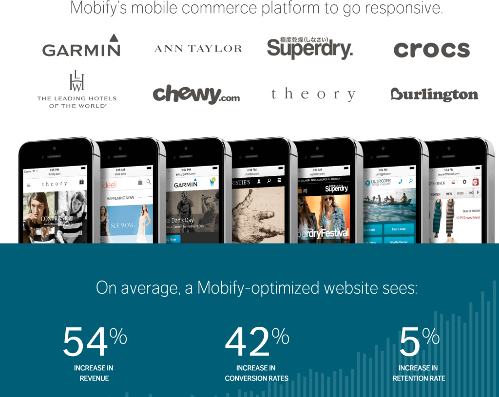
Mobify integrates with your e-commerce store without affecting any of your existing marketing software. It adjusts a presentation layer of your online store on smartphones and tablets, as a result your customers get a better shopping experience. The service also relies on predictive loading and other performance technologies. Thanks to global distribution network, Mobify provides the best shopping experience worldwide.
Related posts
 Shopify or Etsy: Branding Freedom vs. Uniformity
 Etsy vs. Shopify: Which Platform Wins the Marketing and SEO Game?
 Magento to Shopify Migration – The Ultimate Guide
 What is Shopify Used For in 2025? A Comprehensive Guide to E-Commerce Success
 Magento to Shopify Product Migration: Complete 2025 Guide to Import & Export
 Is Shopify Better Than Etsy? Marketplace vs. Standalone Store
 Shopify vs. Etsy Fees Comparison: Which Platform Maximizes Your Profits in 2025?
 25 Best Free Shopify Themes for 2025