Top E-Commerce Website Design Trends 2015
Every successful e-commerce web developer or e-commerce website designer tries to follow top web design trends. The understanding of actual innovations is also important for owners of e-commerce websites. Both categories get benefits from following the new standards: developers and designers provide competitive services and produce high quality websites; e-commerce website owners get better understanding of how to catch new customers and make the existing audience more loyal. In this post we have gathered top e-commerce website design trends of 2015, so get ready for a long journey into the world of innovations.

Table of contents
- 0.1 New requirements for the responsive design
- 0.2 Scrolling over clicking
- 0.3 The importance of typography
- 0.4 Ghost buttons
- 0.5 Material Design by Google
- 0.6 Microinteractions
- 0.7 Card design
- 0.8 Background Images and videos
- 0.9 Hidden Menus
- 0.10 Large Photography
- 0.11 Nearly Flat Design
- 0.12 Device Agnostic
- 0.13 Tile Navigation
- 0.14 Parallax Scrolling
- 1 Overview of web design trends which can be useful for e-commerce design ideas
- 2 E-Commerce design inspiration links
New requirements for the responsive design
Responsive design is among the most important elements of web design. Thousands of different smartphones, tablets and phablets require the unique approach to provide customers with maximum accessibility on whatever devices they use. The difference between 2015 and previous years is in the appearance of new devices and platform. Smart watches and home appliances, smart TVs and smart glasses make the definition of responsive design much broader than before.
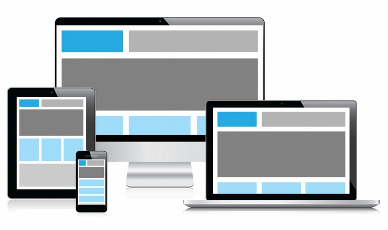
New requirements for the responsive design
Scrolling over clicking
With the popularization of smartphones and tablets, scrolling became popular than clicking. Compared to clicking, it is more convenient and takes less time for page to be loaded. Scrolling also provides users with the ability to get all the information they need without any unnecessary actions.
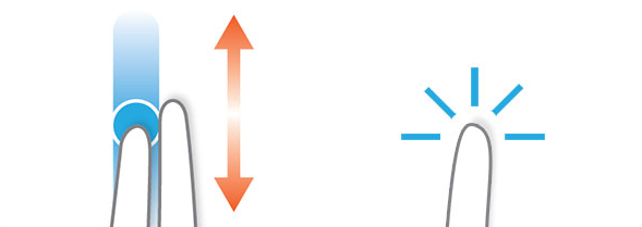
Scrolling over clicking
The importance of typography
Content was always extremely important, but every year customers, search engines and competition provide more strict requirements and new trends. It is obvious, that in 2015 typography will play more important role in e-commerce website design. Simplicity, bold elements, and large images are going to be among dominating design trends of this year. We can even speak about “responsive typography” – a new approach to typography with strong emphasis on responsive design. Typographic flexibility and web-kits are other important features of typography as a ecommerce website design trend.
The importance of typography
Ghost buttons have all chances to become the new favorite web elements. They are attractive, minimal and useful. Ghost buttons look good and attract shopper’s attention in a subtle way. They are not really a call to action but a useful addition to every e-commerce website. You can see the example of ghost buttons on the below image.
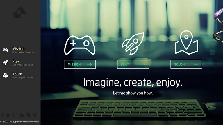
Ghost buttons
Material Design by Google
Mobile commerce also has its own trends. Material Design is a new design direction that Google implemented last year. It relies on skeuomorphism and entirely flat design. Material Design covers different platforms and has its influence on e-commerce website design in 2015.
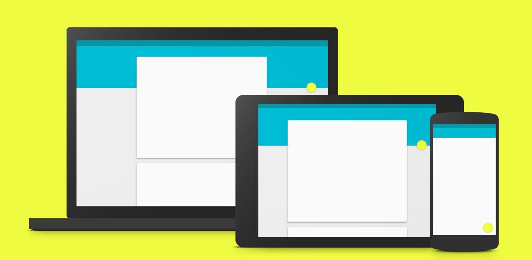
Material Design
Microinteractions
Micronteractions revolves around a single use case, when customer interacts with the website. Signup box is a good example. Microinteractions are necessary for the improvement of customers engagement. During 2015, we will see more useful and sophisticated microinteractions.

Microinteractions
Card design
Card design is going to become an integral part of responsive websites in 2015. The card approach to e-commerce website design provides the ability to organize and arrange things on the great order. In addition, cards allow visitors to get more information easily than any other solution. Card design is simple, clear and informative.

Card design
Background Images and videos
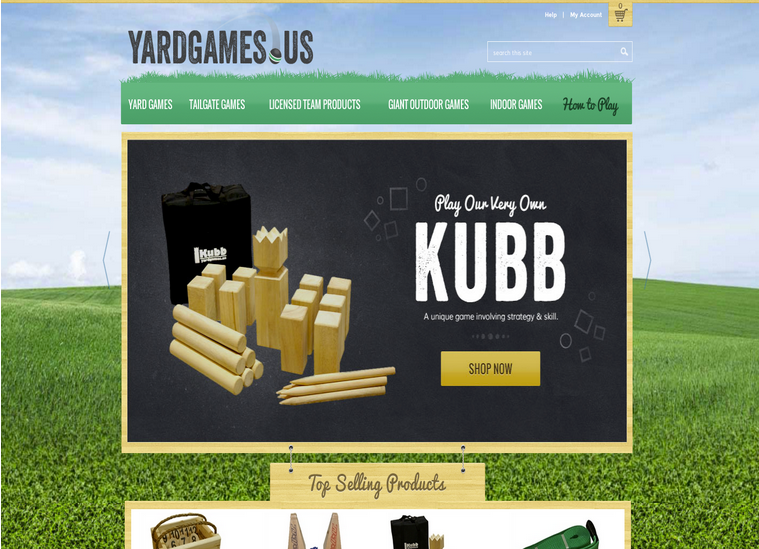
Background always was among the most attractive parts of every website. Keep in mind, that great content looks better over the stunning background image. That’s why background images and videos are always important, and in 2015, they will become a trend for e-commerce website design.
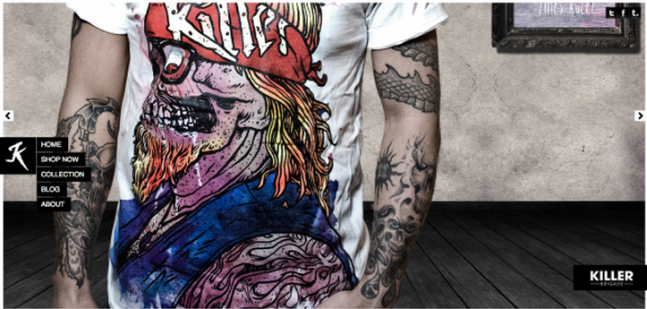
Website with large background image
Hidden Menus
The popularisation of mobile devices has a great influence on design of websites. Because of small screens, smartphones require that some site elements are hidden, but user can always reach them. That’s why global or product navigation is absent in its full size until you hit a special button. Thus, hidden menus are rising in popularity. In 2015, such elements will be widely used even on relatively larger screens. Still many people don’t understand the meaning of hamburger menu icon, so chances are that ecommerce website designers will use it in a tandem with the word “menu”.
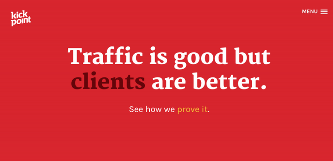
Hidden Menu
Large Photography
Large images always had a negative impact on site speed, so website designers tried to avoid using them in recent years. But with everything changed with improved responsive design. New techniques and adaptive images make it possible to serve fast-loading even with large images. Of course, better content can help e-commerce websites sell more, so we expect to see larger images on home pages and product detail pages in 2015.
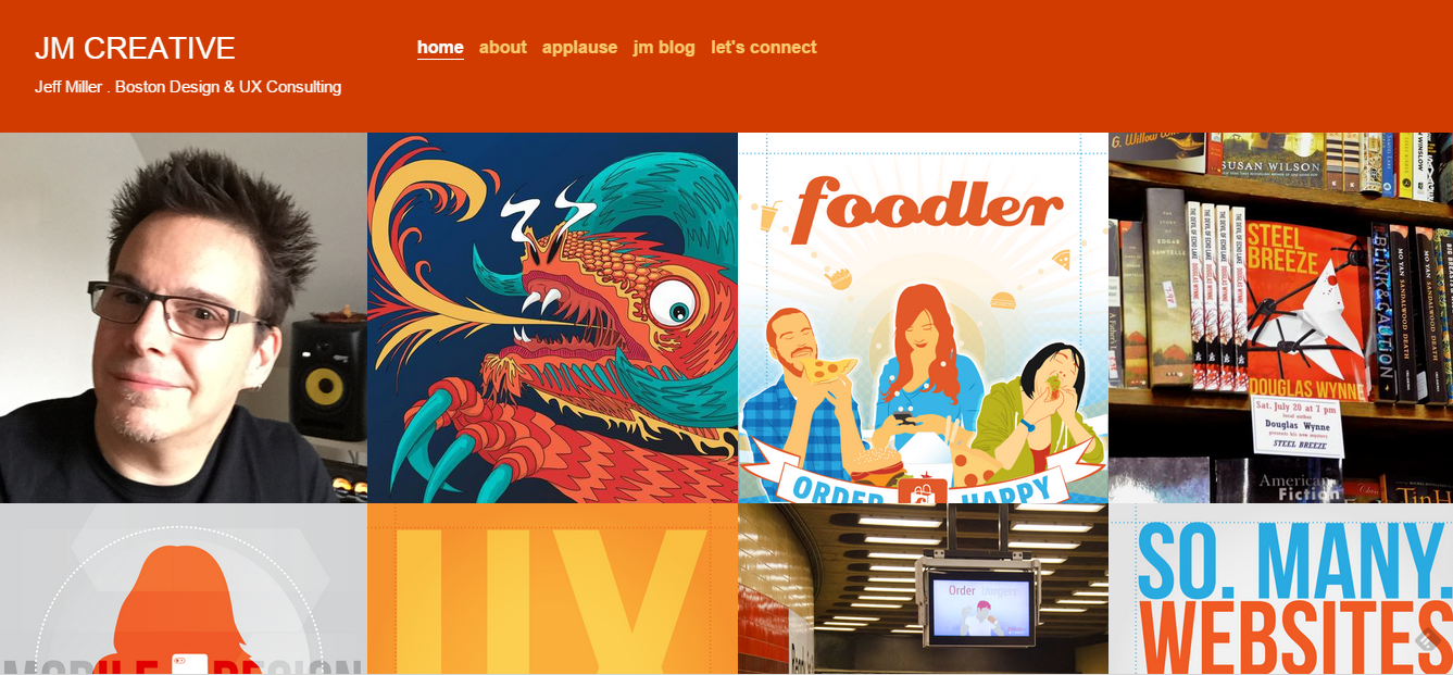
Large Photography
Nearly Flat Design
Thanks to Google, Apple, and Microsoft flat design occupied major mobile platforms. Of course, this idea isn’t new, but it is fresh for ecommerce websites. The trend continues to expand its influence, because flat design is more pleasing to the customers and easier to understand, develop and make responsive. Another advantage of flat design is the focus towards the content. The core principles of skeuomorphism makes such elements as call-to-action buttons unobtrusive. The same is about drop shadows. With the flat design, ecommerce web developer can bring an element to the front of the screen and make it the integral part of the site. The “less is more” principle continues to enhance its influence by turning into one of the leading e-commerce website design trends.
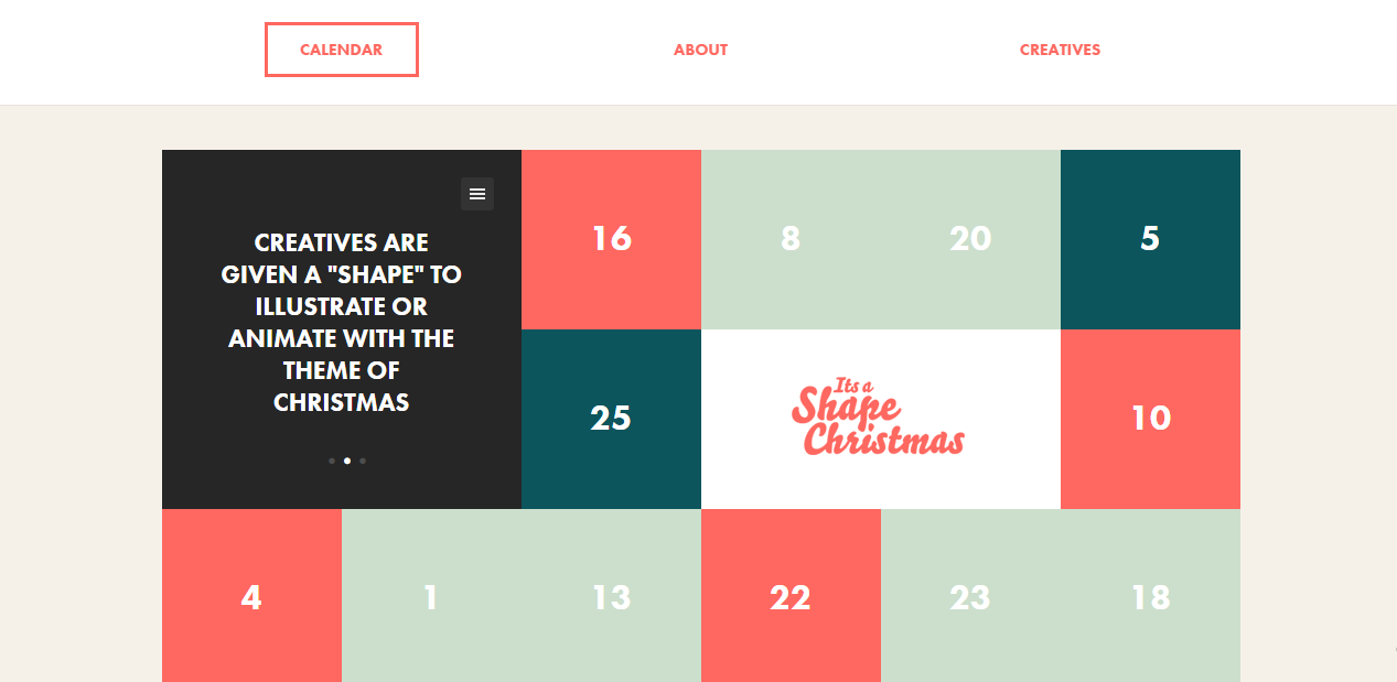
Flat Design
Device Agnostic
Modern e-commerce website should be device agnostic. It’s unacceptable to design web pages for particular devices in 2015. They must function properly on all screen sizes. Today, ecommerce web developer must take into account the amount of screen resolution combinations, all possible input methods, connection speeds and browser requirements to create the universal experience for every visitor. With device-agnostic design visitors will live the ecommerce website wanting to return. Users will be able to navigate through the site and complete the checkout without any need to pinch the screen or aim at buttons.
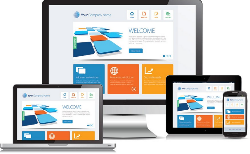
Device Agnostic
Images always were more time-saving and captivating than text boxes. “Less is more” principle lies at the heart of modern navigation. Instead of the standard bar ecommerce websites are implementing tile navigation. By using image tiles instead of lists, web designers provide users with a preview of what they’re going to see. Keep in mind, that tile navigation is more user friendly than any ordinary solution. It has a huge potential to grab the attention of visitors after first few second of interaction with e-commerce website. Tailed navigation recreates the feel of walking into a brick and mortar store, so visitors stay entertained as long as possible.
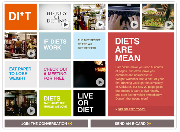
Tile Navigation
Parallax Scrolling
Chances are, you have already seen websites with tantalizing background animation or parallax effect. It can be very impressive, but there is a problem when parallax turns into distraction. The ecommerce website loses its main goal, and instead of presenting products it demonstrates impressive design effects. Keep in mind, that design should be beautiful and at the same time useful. Animations, images and effects should support sales, not overshadow products.
Parallax Scrolling
Overview of web design trends which can be useful for e-commerce design ideas
Econsultancy writes about 17 web design trends for 2015. The author tells about Parallax scrolling, Card and Material design, Ghost buttons, and other aforementioned E-Commerce website design Trends of 2015. The article includes a lot of images and real world examples
Creative Bloq also writes about key web design trends for 2015. In addition to aforementioned features, innovations and tendencies, the author tells about isomorphic JavaScript, privacy and adaptive design.
Key e-commerce website design trends by TNW include simplicity, centered site layout and some of the aforementioned trends. The author shares the unique vision of this topic.
Flat design, enhanced typography, animated content, Parallax effects, multimedia, tiles and better navigation, Google maps and interfaces mashup are among key ecommerce web design trends of 2015 according to Sitepoint.
The author of this article emphasises on prototyping, sketch adoption, handcrafted user experience and tells about some of the aforementioned trends. The post includes a lot of useful links.
Web Designer Depot also has its opinion about key trends. The article describes only 4 og them, but it includes a lot of examples and explanations. Split screens, simplicity, modular structure, and full screen approach are 4 essential layout trends for 2015.
Web Designer Walls adds SVG to our list of trends. In addition to it, the author also tells about 6 other tendencies in e-commerce website design for 2015.
There are also a lot of interesting thoughts about future e-commerce web design trends of 2015 at Designmodo. Big images, Material Design, video backgrounds, enhanced navigation, cards and tiles, parallax are among key trends according to this website.
E-Commerce design inspiration links
Hit the below links to find the most inspiring ecommerce web designs. Every website provides the most modern, beautiful and practical examples of successful e-commerce projects.
You can use oDesk/Elance or other similar platforms to hire website designers or find ecommerce website design companies. Keep in mind, that there are both high quality specialists able to provide modern design and novice developers with only basic understanding of what you want.
