The Best CSS Frameworks And Grid Systems
 CSS frameworks are used for easier and more standards-compliant web design. Most of them contain at least a grid, but there also more functional frameworks with a lot of additional features and functions. Some notable examples are Foundation and Bootstrap. In this post, you will find information about advantages and disadvantages of CSS frameworks, and the most popular solutions and tools.

Among different modules and tools of CSS frameworks, most notable are:
- Reset-Stylesheet
- web typography
- grid
- sets of icons
- styling for different elements
- parts of graphical user interfaces
- tools to create equal height content
- css helper classes
- CSS interpreters like LESS or SASS.
But what are the benefits of using a CSS frameworks? Let’s see the advantages.
Frameworks can help you in learning CSS and understanding how it works. You don’t need to write a code from scratch every time, because this work is already done by someone else. Frameworks also relieve cross-browser concerns, bring their look and feel to all browsers. Another advantage is a grid based design. Grids help you achieve better scanability, readability, balance visual weight, expandability, flexibility, and page cohesiveness. Keep in mind, that all frameworks come with documentation, so you can always rely on support files to get started.
Of course, we should also mention key disadvantages of using CSS frameworks. In order to save time, you need to use one framework and get enough experience to get comfortable within it. Every new framework will require additional time and effort. Because of certain rules, frameworks change the way you write your HTML – you get less freedom. They can include a lot of useless layouts. If every byte of a web page is important, you will have to strip away unused code.
There are two types of CSS frameworks: simple and complete frameworks. This doesn’t mean one type is better than another but that they provide different features and solutions, so can be used for absolutely different projects.
Table of contents
- 1 Simple frameworks
- 2 Complete frameworks
- 3 The Best CSS Frameworks
- 3.1 Bootstrap
- 3.2 Skeleton
- 3.3 Less Framework
- 3.4 Foundation
- 3.5 Gumby Framework
- 3.6 Responsive Grid System
- 3.7 Base
- 3.8 Responsive Grid System
- 3.9 Semantic Grid System
- 3.10 Compass
- 3.11 Fluid Baseline Grid
- 3.12 Columnal
- 3.13 Profound
- 3.14 Gridless
- 3.15 Goldilocks
- 3.16 InuitCSS
- 3.17 YAML
- 3.18 Blueprint
- 3.19 Gridlock
- 3.20 960 Grid System
- 3.21 Kube
- 3.22 Pure
- 3.23 Clank
- 3.24 52Frameworks
- 3.25 UIkit
- 3.26 SproutCore
- 3.27 Layers CSS
Simple frameworks
Such frameworks are called “grid systems” but have all key features of frameworks. They provide style sheets with column system to place different elements according to the design.
- , by Graham Miller
Complete frameworks
Complete frameworks provide such configurable features as styled-typography, buttons, sets of forms, icons and other reusable components designed to provide alerts, navigation, popovers, etc. There are also images frames, custom settings, and HTML templates among other features.
The Best CSS Frameworks
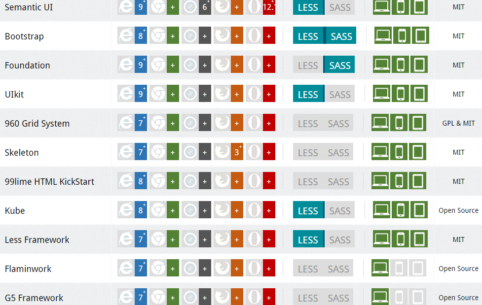
The Best CSS Frameworks by Usablica 1
The Best CSS Frameworks by Usablica 2
The Best CSS Frameworks by Usablica 3
The Best CSS Frameworks by Usablica 4
The Best CSS Frameworks by Usablica 5
This sleek, powerful and intuitive front-end framework relies on a 12-column responsive grid system and includes dozens of styles, components, and JS plugins. Bootstrap also has a basic global display, typography, and link styles. The framework supports the Customizer. You can expand Bootstrap by using a different resources, themes and interface building tools.
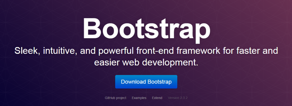
Bootstrap
Skeleton is built on a lightweight 960 grid with simple syntax as an effective cross browser. It elegantly scales down to downsized windows and mobile devices. Skeleton is designed for rapid development and relies on the best CSS practices, such as a well-structured grid and an organized file structure. The framework supplies only basic styles, but it is opened for whatever design you choose. The primary font of Skeleton is Helvetica Neue, but it can be easily changed.
Skeleton
Less is a responsive CSS grid system. It is suitable for four layouts: default, tablet, mobile, wide mobile. The framework provides three sets of typography presets and takes a graceful degradation approach to responsive design. Such desktop apps like Less.app and CodeKit make it extremely simple to use the framework. They automatically compile .less files into CSS.
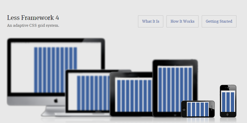
Less Framework
Foundation is based on a flexible 12-column grid which is scalable to an arbitrary size. As a result, framework can be a base for complicated layouts, but you don’t have to create a lot of custom elements. Thanks to “box-sizing: border-box,” borders and padding of Foundation based website don’t affect the overall width of the columns. In addition, the framework provides the mobile-first approach, with which the content is automatically stacked by default. You can also use a separate small grid with Foundation, which is up to the 768px breakpoint. This framework includes dozens of elements and styles designed to speed up the prototyping and build phase.
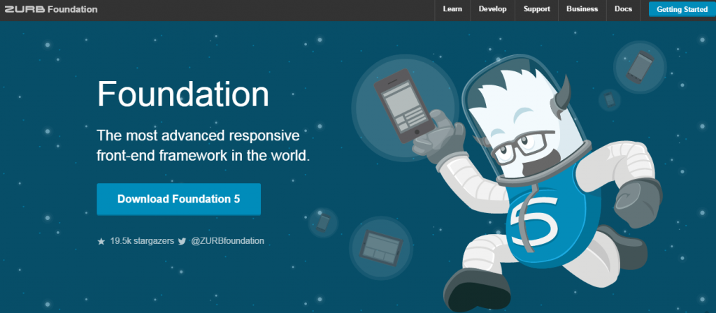
Foundation
This responsive CSS framework is based on Compass and SASS. It provides a hybrid grid that allows to create different layouts by defining what grid should be used on the page. Gumby Framework relies on the latest design trends. It has all the necessary components: buttons, responsive images, skip links, intrinsic ratio video embeds, etc. Gumby is a fully featured, robust framework with a great toolset.
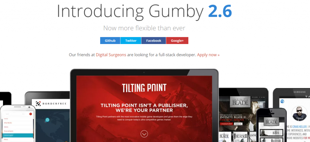
Gumby Framework
Responsive Grid System is not strictly a framework, but it offers an easy way to create a responsive website. With this tool, you can specify up to 12 fluid columns. There are also several mobile versions of the grid, which plugs straight into the existing HTML and CSS. The tool uses percentages for the column widths and gutters. Last but not least is the simplicity of use.
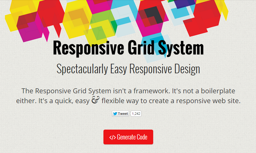
Responsive Grid System
Base is designed for mobile devices, netbooks and desktop computers. In addition, it works with screen readers and provides a nice no-js fallbacks. The framework is based on LESS, so you get the ability to write more organized and easily maintained CSS. Built on top of a 12-column grid, this HTML5 template provides basic styles for headings, blockquotes, tables, forms. Base works best in modern browsers.
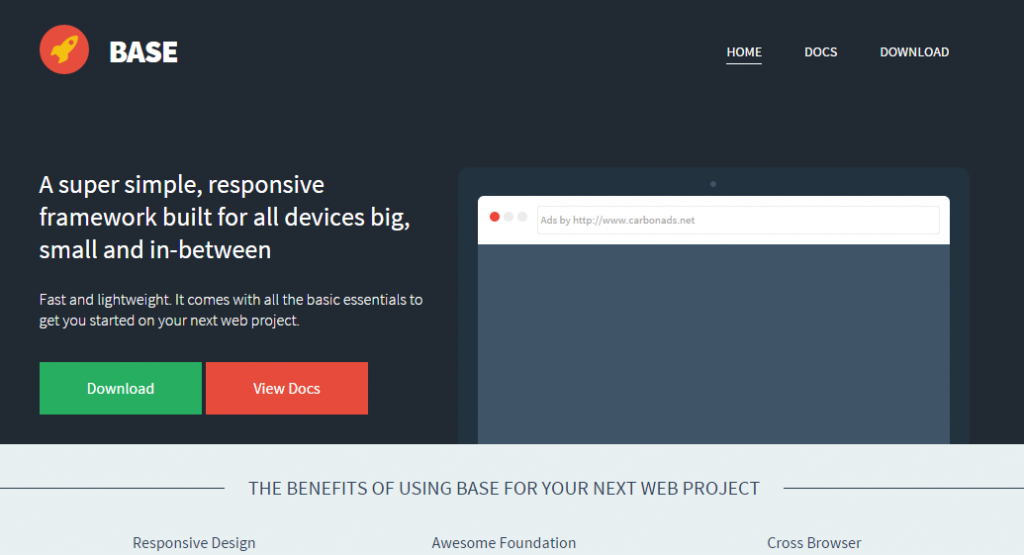
Base
This is another simple CSS framework for fast development. Responsive Grid System is mobile friendly, and is less than 1KB. The framework is available with 12, 16 and 24 columns. It also provides media queries for all standard devices. All styles are separated into individual CSS files. You can use only the necessary styles, keeping bloat to a minimum.
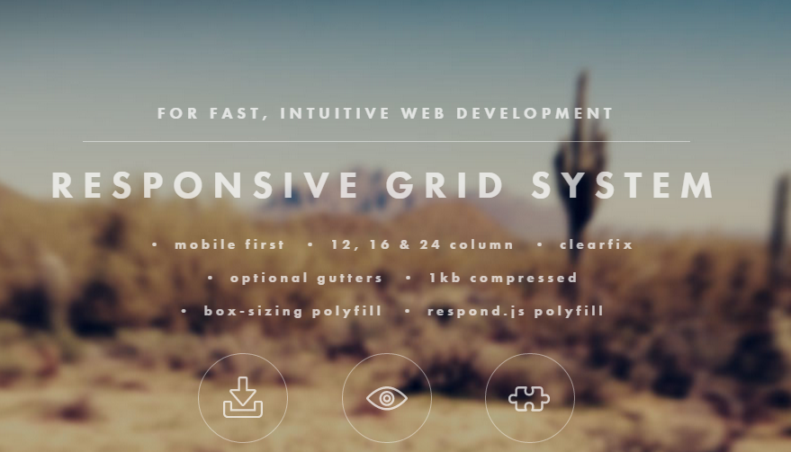
Responsive Grid System
This framework can either be fluid or fixed. It allows you to set the number of columns, their widths and gutter widths. With Semantic Grid System you are able to modify directly in the style sheet. The framework is completely semantic and responsive.
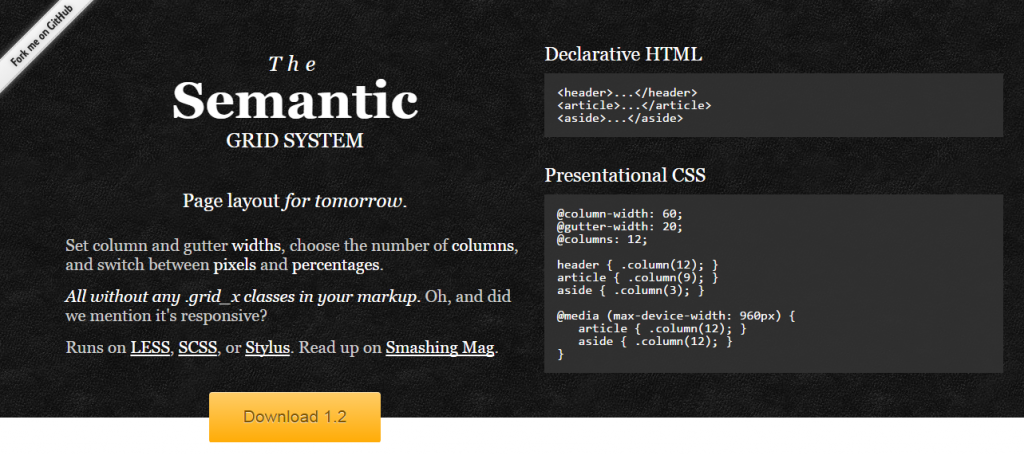
Semantic Grid System
Compass, a CSS Authoring Framework, uses Sass to add rules, mixins, variables, etc. It is designed to generate well formatted CSS and produce stylesheets which are easier to organize. Compass is device-agnostic, it provides common code that can be duplicated across other extensions and frameworks. Key features include cross-browser mixins and creating beautiful typographic rhythms. In addition, it supports a lot of common design patterns.
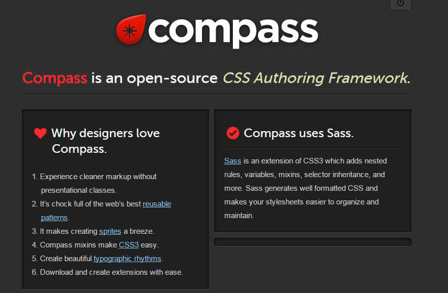
Compass
This HTML5 and CSS3 development kit provides a solid foundation for fast web development. Fluid Baseline Grid relies on typographic standards and combines a baseline grid and a fluid column layout with a responsive design approach. Fluid is defaulted to a three-column folding grid. CSS styles are scaled up from the minimum. With the well thought-out typography, this framework is designed to establish a hierarchy with improved readability. The code of Fluid is lightweight and easily modified.
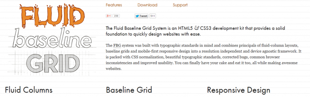
Fluid Baseline Grid
This framework provides a responsive CSS grid, which is 1140px wide. Being fluid, Columnal responds to the width of most browsers. It includes features of both cssgrid.net and 960.gs, mixed with built-in debugging CSS. In addition, you get sub-columns and vertical spacing. The framework comes with a PDF of the grid system, as a result, you are able to sketch and plan. You also get wireframe templates for quick development. The responsive layout of the framework is supported by most modern browsers.
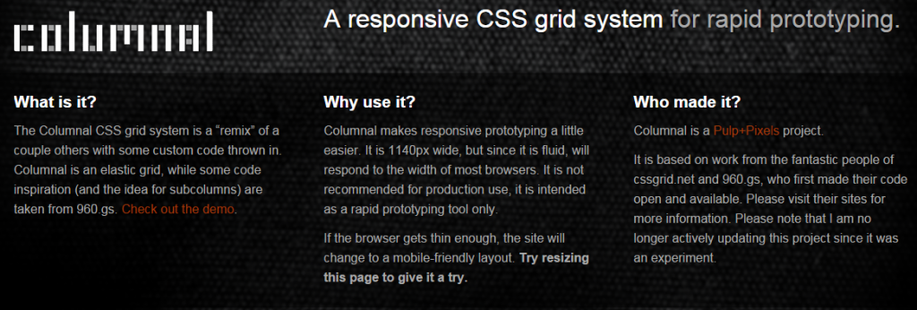
Columnal
Profound is designed for both fixed and fluid layouts. Built in SASS, it gives you a complete flexibility and a full control. With Profound, you can make the grid fluid and all required per-media layouts. It is also possible to change the gutter and column widths or remove columns as needed. The fluid layouts of Profound look exactly the same in every browser. The standout feature of this framework is its flexibility.
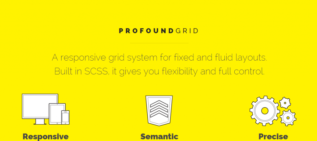
Profound
This is another HTML5 and CSS3 boilerplate for creating cross-browser responsive websites. The framework provides CSS normalization, well-organized folder structure, beautiful typography, IE bug fixes, etc. Gridless adapts automatically to a device’s width, so it works with old phones, new mobile devices, tablets, and bigger desktops. In addition, it’s an extremely simple and straightforward.
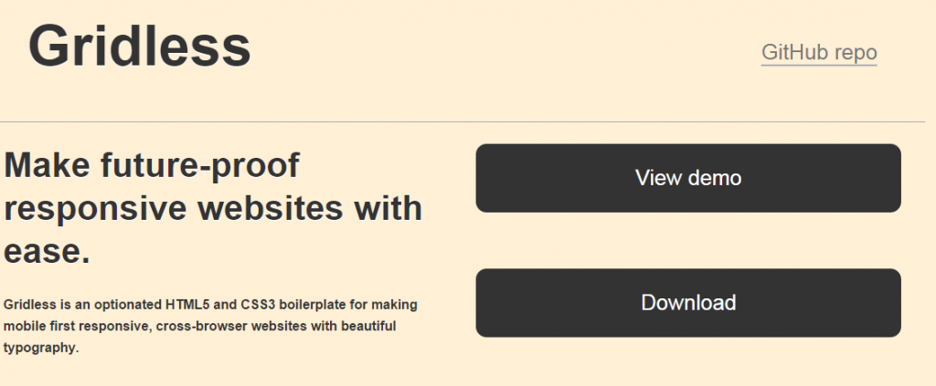
Gridless
Goldilocks relies on a boilerplate approach with CSS and HTML based on the best practices. With this framework, you can build layout that works across all contexts. Multi-column, narrow column and single column are three available states that allow to create a resolution-independent design. In addition, Goldilocks includes good typographic base with print contexts.
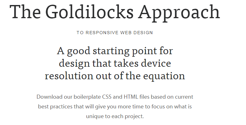
Goldilocks
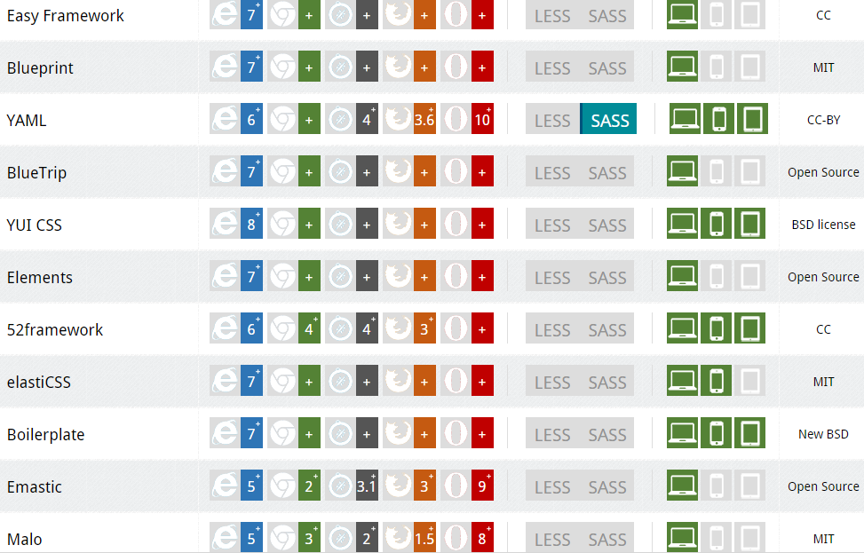
This powerful, object-oriented, scalable framework is based on SASS and includes a lot of objects and abstractions. InuitCSS provides no deleting CSS, no undoing things, and no adhering to other design decisions. The framework was developed for designers who want to focus on the creativity instead of coding. It gives design patterns, not design decisions. InuitCSS features fluid grids, sprites, double-stranded heading hierarchy, buttons, etc.
InuitCSS
YAML or Yet Another Multicolumn Layout is another responsive CSS Framework designed to create modern websites. It relies on a flexible grid system, optimized typography, and small footprint of only 4.6KB. YAML is well prepared for both HTML5 and CSS3. It is a stable, feature rich, versatile layout framework with regular updats.
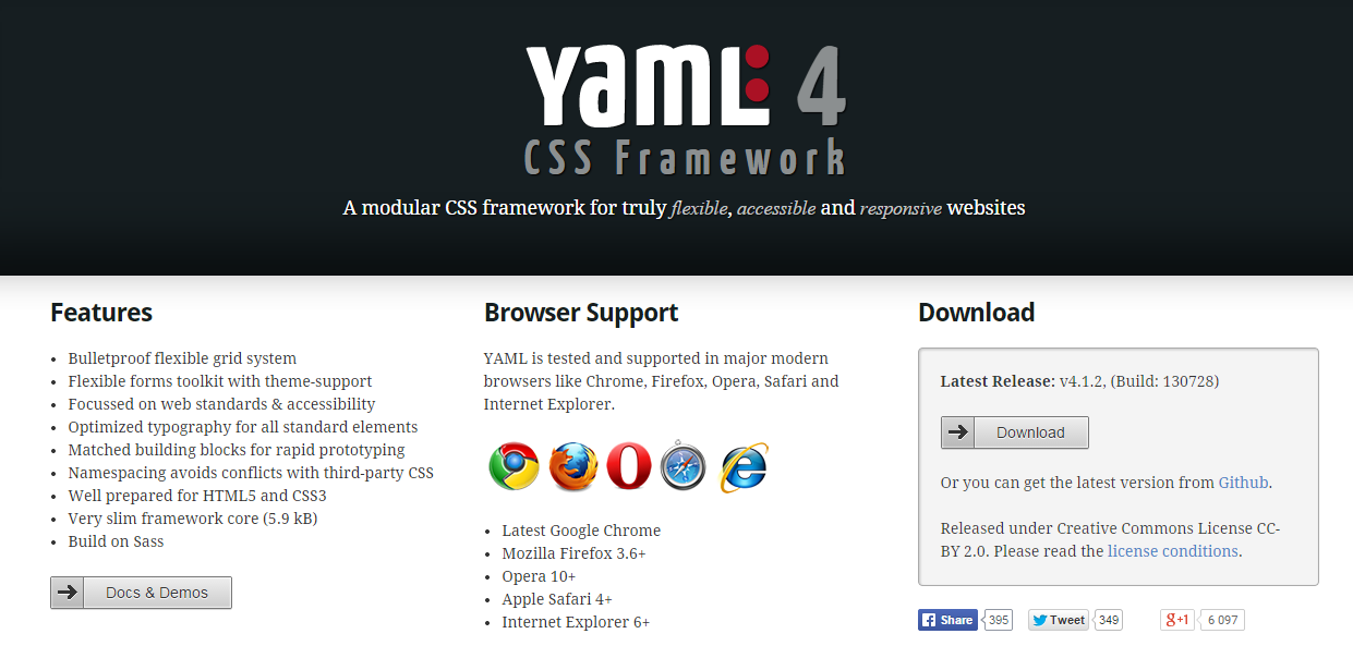
YAML
Blueprint includes an easy-to-use grid, a lot of useful plugins, a sensible typography, and a stylesheet for printing. With the help of CSS reset, any discrepancies across browsers are eliminated. At the same time the solid grid supports the most complex layouts. The framework is set on a typographic baseline. With Blueprint you get powerful scripts for customization, different print styles, tabs, buttons, sprites, and templates. Its layouts can be adapt to mobile devices.
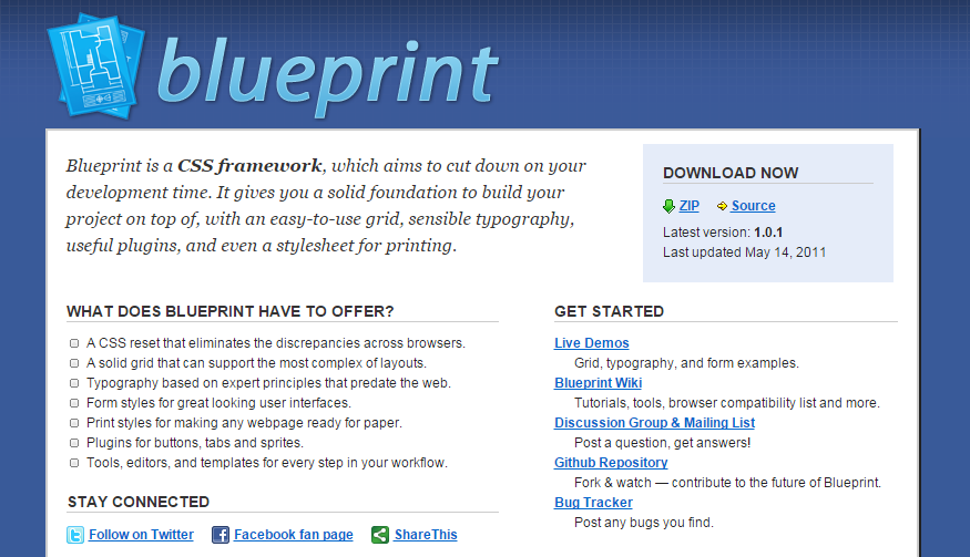
Blueprint
Gridlock utilizes screen size-specific class names and column counts. It provides designers with the foundation for crafting an experience that matches for different devices. Three distinct grid sizes of Gridlock are: desktop, mobile, tablet. 12 columns are used in a desktop grid; 6 in tablet grid; and 3 in mobile grid. The syntax of this CSS framework is easy to read. It can be easily adjusted to fit the target devices. There are also some faction helper classes in Gridlock.
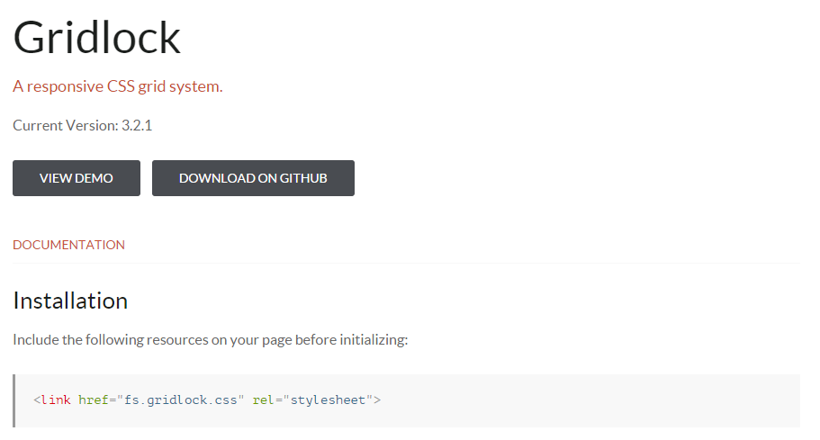
Gridlock
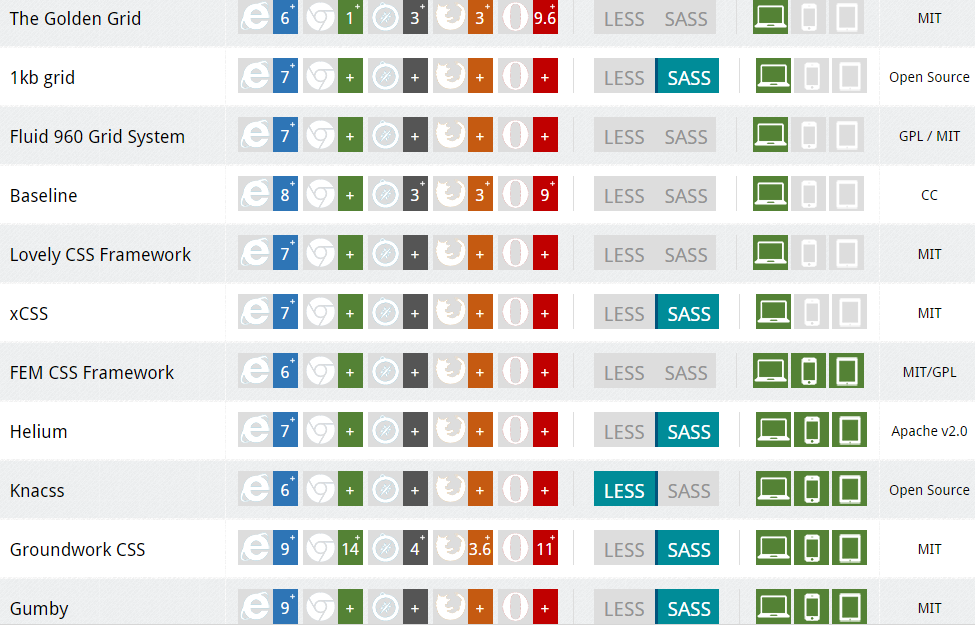
960.gs ideally suits for rapid prototyping. The framework provides a 960px-wide container, which can be divided into 12/16/24 columns. There is also a 10px margin at the left and right of the main content column. Additionally, 960 Grid System supports “push” and “pull” CSS classes.
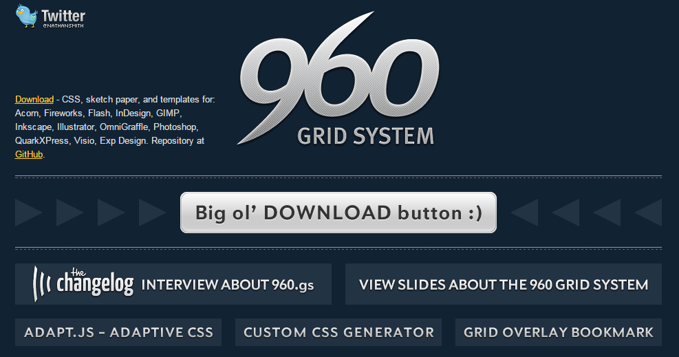
960 Grid System
Kube is another tool designed to ease up the process of web designing. The framework is adaptive and responsive, it supports everything needed for designing a site in a quick time.
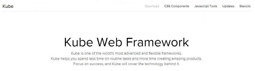
Kube
Pure provides a set of small and responsive CSS modules for almost all web designing projects. You can always get effective and quick results with this framework.
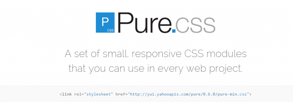
Pure
This is an efficient HTML/CSS framework. It is often used for prototyping applications for mobile devices. Clank relies on Saas CSS pre-processor. The framework promotes quick development for mobile phones and tablets.
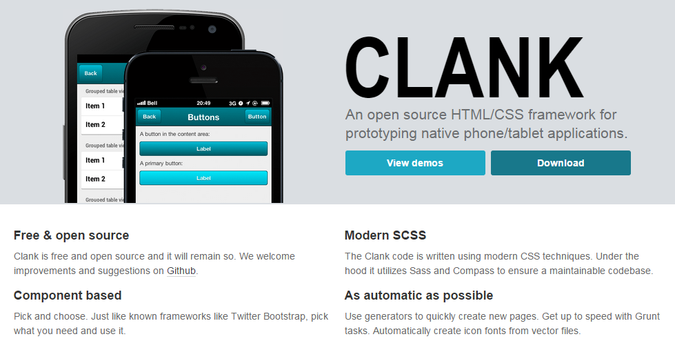
Clank
Another awesome tool for HTML5 and CSS3 users. The framework supports HTML5 Validation via JavaScript.
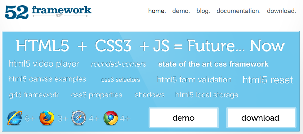
52Frameworks
UIkit is a modular lightweight front-end framework designed to develop powerful web interfaces. It provides different HTML, CSS, and JavaScript components which are simple to use and easy to customize.
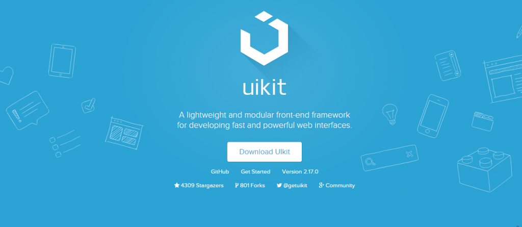
UIkit
With SproutCore framework you will be able to build fast and innovative web projects. With incredible speed, latest web technologies and specifications, SproutCore is very reliable solution, which is accessible from everywhere you want.
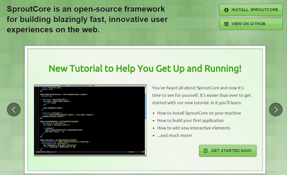
SproutCore
This CSS framework is a lightweight solution that doesn’t provide any designs but has a robust main structure. Layers CSS has a support for responsive layout with fluid grids and simple classes.
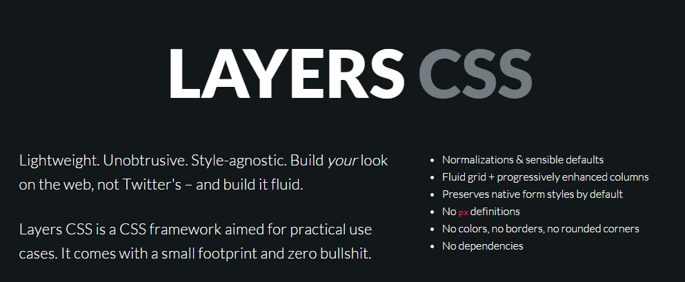
Layers CSS
Related posts
 CopyAI Review 2023
 Magento 2 B2B Company Guide: Revealing Company Structure & Import
 How To Bulk Import Products In Shopify: CSV Description & Step-By-Step Guide
 Reputon Amazon Importer Review: How to Connect Shopify to Amazon in a Few Clicks
 How to Import Customers & Customer Addresses to Magento 2
 Shopware 6 Advanced Pricing Guide + Import Tutorial
 Magento Open Source and Adobe Commerce 2.4.7 Release Notes
 Magento 2 Release Notes