Typographic hierarchy in e-commerce: tips and examples
Typographic hierarchy is an extremely important method of design. It is used for making information more readable, sorting text information by importance and helping with structure and usability of the design peace so the consumer could navigate through the piece easily, finding what he or she needs fast and easy.

Typographic hierarchy means that the text has some cues, such as:
-
Spatial (indent, line spacing, placement)
-
Graphic (size, style, color)
-
Mixed.
Some predictability and redundancy is quite usual for typographic hierarchy, as it lets the consumer follow the patterns.
Normally, one cue is enough to emphasize an element inside a paragraph, and no more than three signals are needed to emphasize headlines.
Table of contents
- 1 Typographic hierarchy in e-commerce web design
- 2 Fitbit Flex product page
- 3 Whitney.org contact page
- 4 Menu typography by Anthropologie
- 5 montblanc.com homepage
- 6 butchersandbicycles.com information page
- 7 theediblecompany.com about page combines hierarchy and style
- 8 Takeaway! Typographic hierarchy is a help when you need:
Typographic hierarchy in e-commerce web design
When we speak of typography in web design for online shops, we should distinguish the depth of hierarchy based on the type of the page.
The more content you have on your page, the more difference between importance levels of the content pieces you imply, the more visual difference between cues should be implemented.
For an average product page, at least three levels of hierarchy are recommended. Depending on the amount of content, even four or five could be used.
Here’s a short description of levels you can point out on an average page:
-
Primary level (headlines)
-
Secondary level (subheads, captions, pull quotes, supportive text blocks)
-
Base level (main content, common and simple)
-
Smaller levels (italics, bolding, color, links, separate words, texts on banners, logos, background graphics)
Let’s take a couple of successful examples and see how these rules are working on real e-commerce shops.
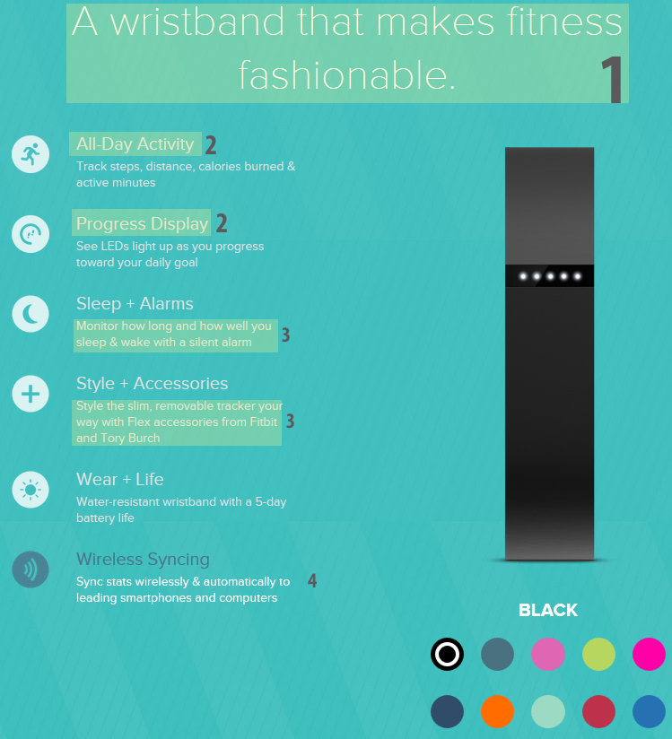
Fitbit Flex product page
Fitbit has genuinely designed product pages, and still these hierarchy principles are used, let’s trace them!
The first level is the headline.
The second level is subheadlines of product features description.
The third level is product features description.
The fourth level is dynamic change of color that moves from point to point, catching your attention.
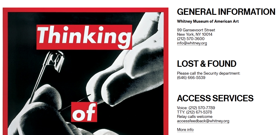
Whitney.org contact page
If you have many departments or contact addresses, it’s a good idea to use at least two levels of font size so the customer could see at once which department he is going to contact.
This page is purely informational, so size cue is pretty much enough.
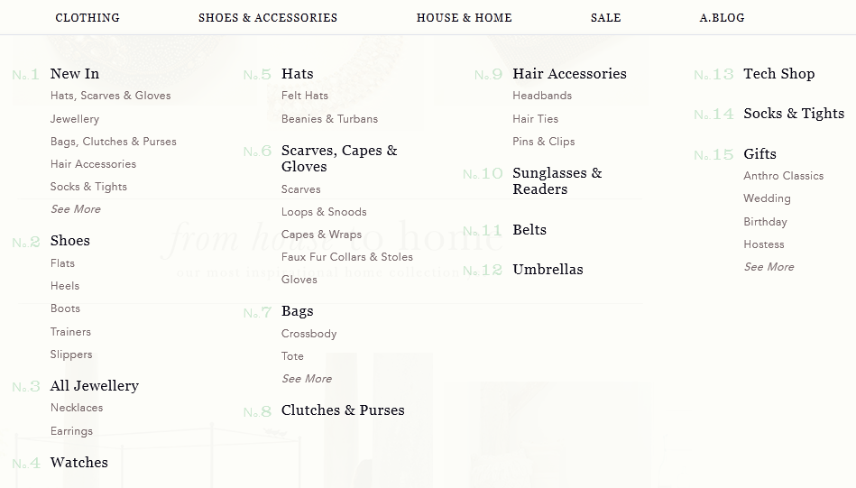
Menu typography by Anthropologie
Anthropologie didn’t use multi-level menu, still they needed to point out the main categories. Typographic hierarchy is the best decision for the case.
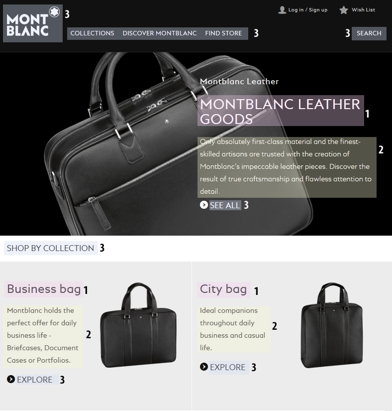
montblanc.com homepage
It’s quite easy to trace three typographic levels on this homepage. The first is for headlines, the second is for common text (which can also serve as subheadlines), and the third is for links, menus and the logo.
Together it goes into a beautiful ensemble, and this is done with a single font using size, spaces between lines and capital letters.
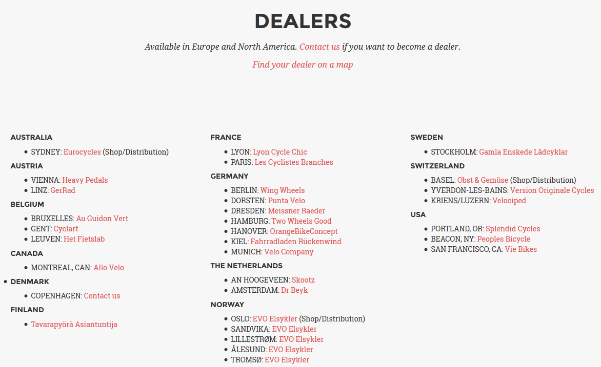
butchersandbicycles.com information page
Any additional pages with information about shops, dealers, shipping and delivery terms should be also created with having typographical hierarchy in mind – no bedsheets of dull text, please. Countries, cities and links are distinguished by color, capitalization and bolding.
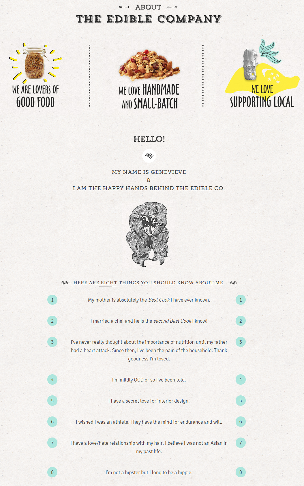
theediblecompany.com about page combines hierarchy and style
This is sad to say, but the text on most ‘about company pages’ is not readable at all, because a couple of dreary paragraphs don’t have a single word to catch on. This page clearly shows how you can make your About page pleasant to read using your typography wisely.
Takeaway! Typographic hierarchy is a help when you need:
-
To make product page information readable;
-
To help customers navigate through pages and menus;
-
To make boring pages more exciting to read;
-
To make the homepage stylish and rhythmic, to help customers make the first choice.
Do you use typographical hierarchy on your online shop? Share examples in comments!
Ksenia Dobreva

Ksenia is a devoted marketer with special love to blogging. She believes that content with several pinches of SEO and social can be a brilliant daily special. When she’s not working on Amasty updates and blog posts, Ksenia runs a blog on movies and books, enjoys the online feminist community and helps animal shelters.
Related posts
 Amasty ChatGPT AI Content Generator for Magento 2
 Magento 2 B2B Company Guide: Revealing Company Structure & Import
 How to Import Customers & Customer Addresses to Magento 2
 A Complete Guide to Shopify Customer Import
 Reputon Amazon Importer Review: How to Connect Shopify to Amazon in a Few Clicks
 Adobe (Magento 2) Commerce and Cloud (Enterprise Edition) Specific Features
 EasyImport: How To Connect Shopify With Etsy
 Magento 2 Cart Price Rules: Create, Edit & Import