Web design trends 2016

The main feature of any trend is that it cannot exist forever. Once having been adopted, it can either transform into a new trend or gradually become commonplace losing its ability to attract people’s attention. This tendency also concerns web design trends which are too hard to predict but pretty much easy to grasp. The current trend goes back to the beginning of 2014 when the sphere of web design experienced significant improvement in terms of website development, style, and content management. For instance, the extensive use of mobile devices encouraged developers to concentrate more on the ability of webpages to suit the screens of smartphones and tablets. This caused the following burst of responsive design which now became the most valued characteristic of a website. Other improvements touched upon the general style of a webpage. Sites started to look fresher thanks to the introduction of wide backgrounds, parallax scrolling technique and innovative hero sliders.
E-commerce platforms also contributed a lot to the current look of majority of Internet resources. WordPress’s enormous success on the global market led to the increase of new websites built up on the company’s original themes and easy-to-use dev base. The downside of it, of course, is that now there are so many alike websites that it’s often hard to distinguish between their content.
So what to expect from web design in the coming year? Will it remain the same or will it be transformed into something new? Which trends are most likely to become popular from the January onwards? These questions are of utmost importance to E-commerce businesses aiming at keeping their websites relevant and attractive to the customer’s eye.
Let’s try to look through the looking-glass and see which web design trends deserve to be adopted in 2016.
Table of contents
- 1 A search for originality
- 2 Devotion to the flat/almost-flat design
- 3 Micro app solutions
- 4 From clicking to scrolling
- 5 More attention to typography
- 6 Greater emphasis on Usability Testing
- 7 UI animation
- 8 Responsive Web Design
- 9 Card design for small devices
- 10 New design languages
- 11 Visual storytelling
- 12 Frequent speed testing
- 13 Ghost buttons
- 14 Sticky navigation menu
- 15 Hidden menus
- 16 Backgrounds with patterns
- 17 Conclusion
A search for originality
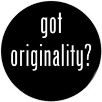
As we’ve mentioned before, it’s quite a difficult task to be original nowadays. As soon as one website adopts a new design feature, in a couple of weeks it extends to dozens of other websites, which makes it completely impossible to identify the discoverer of the trend. The tendency of the mass adoption is a kind of a side effect to the enormous spread of information on the Internet, but there are still ways for E-commerce businesses to keep their originality.
One way is to utilize authentic elements created from scratch so that they could not be copied or stolen. They can be custom images and animations brought to you by a skillful designer or the most convenient Flash alternatives, such as HTML5, JS, or CSS3. There is no special technique worth using, so you should be ready to experiment with various styles and their combinations to perfectly suit your individual needs.
Another way to gain originality concerns the content itself. It’s really hard to surprise people with something, but if you still intend to attract customers’ attention without changing your product assortment, you will have to work on how to present it in the most original way. Find the most suitable combination of images, text and titles on one page for it to get a fresher look and better user feedback.
Devotion to the flat/almost-flat design
This trend is a part of a general trend in web design that started back in 2014, and you might have guessed that its appearance was also connected with the increased popularity of mobile gadgets. It has all the chances to remain up-to-date in 2016 though, spreading from mobile to desktop website versions.
The first introduction of the flat design took place after the release of iOS 7/8 and Android 5.0, the latter adding up to it by their exclusive material design pattern. The design looked attractive due to consisting of one singular color, simple shapes and neat typography. This brought a great deal of minimalism to the whole perception of a website’s visual content.
The main advantage of the flat design is that it has almost no weight in terms of a page load speed. As a result, it becomes especially handy when there is a need for improving Google’s search engine rankings. Not only will it increase overall responsiveness of a website, but it will also win more space for advanced code-generated elements to promote the general style of your page.
There is also a newer alternative to the original flat design called the almost-flat design. It differs from the previous one in that it acquired more depth, complex shadows, and a certain dimension. It’s frequently admitted that the almost-flat design has much more to offer to the future style of webpages because it looks as attractive on desktop as it does on mobile versions. Google has successfully adopted this design for their mail service, so perhaps it would be reasonable to bear that in mind when it’s time to adopt a new-coming trend.
Micro app solutions
Micro apps are being widely used on various websites to prevent users from a tiresome search and endless clicks leading to nowhere. They are light helpful apps that pop up on a site at the most suitable moment: after scrolling down to the end of an article, during the view of a gallery, before leaving the page, etc. They look like simple cells encouraging users for a specific action: to register, make an order, ask a question, and many more. Once you interact with a small cell, you will be automatically redirected to a new page or a specialized wizard that will assist you with the rest of a chosen procedure.
Using these micro elements for your website might not contribute to the overall speed, but it will definitely make it easier for a user to navigate through your pages, which is another important step for improving user experience. Thus, this technique has all the chances to remain relevant in the coming web design trend.
From clicking to scrolling
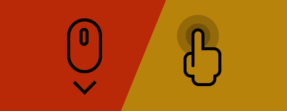
The current web design trend swiftly shifts from regular clicking to vertical scrolling allowing users to see all the necessary content on the one page. This technique was adopted by social networks a long time ago until somebody realized that it would perfectly suit other kinds of pages as well. The problem is, however, that vertical scrolling cannot be used for displaying sufficient portions of relevant content (especially in the form of plain text), as readers would probably fail to scroll down to the important point after dozens of previous swipes.
Vertical scrolling technique is often used for landing pages, as it’s made specifically for attracting users’ attention and sharing clue features of a website. It’s also good for being introduced on one page websites with a little of content.
Basically, the concept of vertical scrolling has recently developed into two popular techniques: endless scrolling and parallax scrolling.
Endless scrolling allows to scroll down through the equal portions of the content that are automatically loaded every time users reach the end of each portion. Such social networking sites as Tumblr actively use it to let subscribers navigate through a great number of images more easily. Endless scrolling can be realized on CSS3 or HTML5 for simple two-layered pages as well as more complex sites containing advanced animation in various dimensions.
Parallax scrolling is a kind of scrolling that is based on the illusion of movement. Developers adopted original graphical solution for this technique by making background elements move slower than foreground ones while scrolling. This also allowed to experiment with various types of 2D graphics, which often led to interesting and even artistic outcomes. is a nice example of a high-end parallax scrolling implementation.
More attention to typography
Although finding a good font is not a problem anymore, thanks to a bunch of free fonts available in the world web, dealing with typography is still an important issue for many website developers. Typography is essentially important for drawing a user’s attention as it has power to:
- make your textual content more relevant;
- enhance your website design;
- make your brand easier to memorize.
The opposite side of it, of course, is that it can completely spoil the general impression if used incorrectly.
The perfect choice for every website owner is to use custom fonts created by a skillful designer. This will make your brand unique and easier to associate with. Remember that typography is not just a part of design but rather a means to create the atmosphere, tell the store, and convey the ideas.
This year’s trend in typography touches upon the usage of large fonts. It’s reasonable to suggest that it will continue to spread among the Internet in 2016 as well. Such websites as , , , and others have successfully adopted large typography encouraging their visitors to read their headings and brand names.
Greater emphasis on Usability Testing
This is surely going to be a trend of 2016, as Usability Testing is a relatively new but very progressive area of application development. User Experience (UX) designers are especially important for mobile and web app development today when there is a great need for creating advanced and highly user-friendly environment. The more usability tests your website/app goes through, the more successful it will be in result. Google and Facebook were the first to introduce specialized usability tools allowing to check overall performance of apps and sites based on their platforms. Even more emphasis on usability testing is expected to be put next year, so don’t hesitate to give it a try.
UI animation
After the mass transmission from Flash to CSS and JavaScript a lot of smart solutions have been introduced to enhance the look of modern webpages. Original video badges, catchy GIFs, and minimal icon animations made their way into becoming a commonplace practice in the field of mainstream web design. The year of 2016 will see even more extensive use of CSS exclusive transitions, JS libraries, and handy tools such as GreenSock.
Responsive Web Design
It’s worth mentioning responsive web design in a more specific way. The question of responsiveness has become so crucial nowadays that many websites are doomed to failure just for not meeting modern search engines’ requirements. Thus, Google has developed a specialized tool that allows website owners to check the responsiveness of their resources. The results are usually low if your site is not mobile friendly, which will probably give you no chances in terms of good indexing in Google search results. That’s why you should put more effort into making your website as responsive as possible.

Responsive web design (or simply RWD) is no longer a new way of building websites but rather a necessary part of every dev process. It combines in itself simplified site navigation, intuitive page elements, and smarter content architecture. But the main concept of the trend lies in the ability of site elements, as well as its content, to vary depending on the width of the screen it’s displayed on. RWD aims at recognizing the device which is being currently used for navigation and transforming a page in the most appropriate form. For instance, screens with smaller resolution will require a website to change its layout to vertical minimizing the size of menu bars and columns in favour of mobile interface. The same is applicable to fonts and links used in website content.
Recent studies of responsive web design have shown that the higher percentage of traffic comes to website owners from mobile devices, which clearly proves the power of the trend. We can therefore admit that RWD is likely to remain a basic standard of modern website design for quite a long period of time. So no matter what trend comes next, it will still continue to use RWD for building web and mobile applications.
Card design for small devices
As a logical consequence of responsive web design adoption, there is a need for utilizing smaller website elements inside of smaller interfaces which, in their turn, would fit smaller screens. That’s when card design becomes really handy.
Basically, card design will divide your website content into separate areas or simply cards to make every piece of information look equally relevant and attractive for a viewer. Every card can display its content completely or partially saving overall space and motivating for viewing the complete version.
Card design has been already used by such giants as Twitter, Pinterest, Google Now, and Apple Glances. However, the area of card design building is still fresh enough to search for original solutions and ways to implement them.
New design languages
Languages are also capable of setting design trends in motion. In fact, new design languages appear to make it possible to introduce more innovative solutions and styles. For instance, a new Google material design released in 2014 has served as a basis for the majority of mobile apps and websites created during the next year and a half. Another example is Flat/Metro language which was successfully adopted by Microsoft in their Windows 8. These languages are famous primarily for their innovative use of typography, colors, and animation in both 2D and 3D dimensions, which allows us to predict that next year we will probably see a set of newer languages helping to create even more advanced stuff in the sphere of web design.
Visual storytelling
No matter how good your content is, you should understand that it will never reach a user if it does not meet his or her expectations. Generally, users would prefer to look at catchy, simple, and clearly conveyed content rather than long boring paragraphs of plain text with pictures that tell nothing but the fact that you have found them on the nearest Google pics list. Perfectly organized content should consist of a nice combination of text, graphics, and even empty space to be able to catch a viewer’s eye.
One way to structure your content is to understand that text and images, although being different in their nature, can exist one within another, even in the context of a web page. For instance, you could make a background consisting of high resolution pictures and even videos and then apply previously mentioned parallax scrolling technique that would allow you to present valuable pieces of text as a foreground for corresponding pictures playing part of a visual representation of its meaning. website is the exact example of smart visual storytelling which is worth adopting. We can expect this technique to be acquired by the number of websites trying to find the best look for their brand.
Frequent speed testing
With all these upcoming design trends ahead, E-commerce retailers will need to pay more attention to how much weight they gain after applying all those innovative themes and code generated applications to their websites. For those that would like to gain control over their website performance, we offer utilizing Google’s Page Speed Tool. It will help you to determine whether your site is overloaded by excessive elements and whether you need to improve its performance accordingly. Because speed is a necessary part of Responsive Web Design, you should aim at making your website as fast as possible. More specifically, you will need to concentrate on:
- fast hosting;
- choosing SVG images rather than PNG’s;
- separate images for default screen resolutions and Retina display;
- placing script tags at the bottom of the page;
- compressing CSS and JS files when deploying.
Ghost buttons can perfectly coexist with the flat design adding up to overall minimalism of a webpage. In consists of a clickable area which has transparent background and a plain border which will encourage clicking on it even more than a brightly clean-cut alternative.
This feature can perfectly suit websites utilizing vertical scrolling. Sticky bar is a good opportunity for a user to have an access to any website category without a necessity to scroll back to the top of a page. Although it occupies a certain space on the scree, it still has enough power to be welcomed rather than criticized.
Hidden menus are most popular among those who can’t stand sticky navigation bar technique in the first place. Some designers see them as the main threat to the adequate user perception, others are inclined to think that they use too much space which is created more for the content rather than navigation elements. As a result, hidden menus also come into use on both mobile and desktop website versions. It’s hard to predict which menu style is going to prevail in the coming trend, but you can already decide which one is more to your liking.
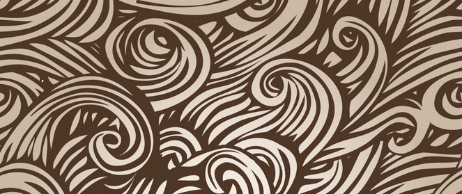
Backgrounds with patterns
At first it may seem that patterns on the background have nothing to do with a better readability of the text placed above it, but the general experience of web designers proves it to be true. In fact, patterned background turned out to significantly improve text perception and increase general time spent on reading as well.
Conclusion
If you think that above listed web design features are too different to be used for one website, you are totally right. But you should not necessarily adopt all of them in one time. Some of the trends exist today and will continue to be popular for several years longer; some of them are likely to start off from the New Year onwards, as they need some time to trigger off. Nevertheless, you can already evaluate which trends could become the best fit for your brand and, what’s more important, for your customers who are to be primary judges of your final web design.
Related posts
 How to Import Customers & Customer Addresses to Magento 2
 Amasty ChatGPT AI Content Generator for Magento 2
 A Complete Guide to Shopify Customer Import
 Magento 2 B2B Company Guide: Revealing Company Structure & Import
 Reputon Amazon Importer Review: How to Connect Shopify to Amazon in a Few Clicks
 Adobe (Magento 2) Commerce and Cloud (Enterprise Edition) Specific Features
 AutoSync Canva Integration: How To Integrate Product Images Into Canva?
 Unirgy uRapidFlow Magento 2 Extension review and comparison with Improved Import