
DIY SEO: Mobile SEO

It has been a year now since Google announced mobile friendliness to have become an important factor for determining the relevance of a website. This seems to be inevitable if we consider the fact that each year there are more and more people preferring mobile over desktop for surfing the Internet, communicating, working, and relaxing. Every fourth instance of an Internet search is performed through a mobile device, while almost 80% of all smartphones are used for local search purposes. Moreover, due to the functional differences, searching on PC and searching on mobile is performed in a completely different way. With this information in mind, E-Commerce businesses should obviously start thinking about enhancing their online presence by meeting the needs of mobile searchers and their devices.
Becoming mobile-friendly is the first requirement of a good mobile search engine optimization strategy. Like traditional SEO, mobile SEO allows you to rank higher in SERPs, but the actual ways of achieving this aim are a bit different in the latter one. The concept of mobile friendliness is linked to the mobile user himself, what he expects to see when tapping on your link, and how he is to behave on the mobile version of the site. However, mobile SEO is much more than that. It is an opportunity to use technological growth for the sake of the growth of your own company.
So, this definitive guide is going to answer all your questions concerning mobile SEO and the ways of making your website both mobile-friendly and technically efficient. Note that the following article can be used as a Magento mobile SEO guide. The information gathered below is aimed at various platforms and websites, so you can easily leverage it while optimizing your ecommerce business.

Table of contents
- 1 What can you achieve with mobile SEO?
- 2 What should you know about getting ranked in Google before you start with your mobile SEO campaign?
- 3 Build a Google-approved competitive mobile version of your website
- 4 Let search engines know you are mobile-friendly
- 5 Other handy mobile SEO tips
- 5.1 1. Perform a keyword research for your mobile website
- 5.2 2. Improve your titles and meta descriptions to attract more mobile visitors
- 5.3 3. Apply appropriate data markup to become more visible in mobile SERPs
- 5.4 4. Provide your mobile website with some local SEO features
- 5.5 5. Re-test your mobile website’s performance and get it indexed again
- 6 Optimizing mobile user experience
- 6.1 1. Start with improving the technical side of your mobile website
- 6.2 2. Protect your mobile site from unwanted visitors
- 6.3 3. Simplify the sign-up process for mobile use
- 6.4 4. Stay in touch with your customers with an on-site click-to-call feature
- 6.5 5. Include a ‘Share’ button to your mobile site
- 6.6 6. Customize your website’s URL to make it more visible for mobile searchers
- 7 App Store Optimization (ASO)
- 8 Conclusion
What can you achieve with mobile SEO?
Generally, there are various reasons why you might want to start your own mobile SEO campaign. Apart from being a perfect source of gaining a high PageRank, it can also help you achieve better results in converting searchers into customers. Because more and more retail purchases are being made through mobile, getting your website user-friendly for the owners of portable devices is a smart thing to do. Eventually, dealing with mobile search engine optimization will bring you the following:
- An extensive promotion of your brand through mobile search;
- More mobile-based traffic;
- Higher conversion rates;
- More sales and, accordingly, higher revenues.
Another reason behind aiming at mobile is that it is pretty much popular among users to constantly shift from desktop to mobile or from one device to another. For example, a person can start searching for a particular product from a smartphone and, when found, sending a corresponding link to himself/herself to later go purchasing it from a home PC. Or, a person can first perform the search from his/her smartphone, then accidentally lose the link to a particular website page and later search for it from another device.
Finally, there is a definite reason behind Google’s recent updates considering the importance of mobile-friendliness for a website. With a constantly growing percentage of mobile traffic on the web, it is clear that businesses won’t do without optimizing their websites for smartphones and tablets. By providing website owners with , Google helps them to get the most of their business potential and ensures that following its official advice will guarantee higher rankings in SERPs.
What should you know about getting ranked in Google before you start with your mobile SEO campaign?

As you might have known, before your website gets officially ranked, it is first being indexed by search engine crawlers that scan it carefully page after page. Indexing involves finding meaningful elements on your website that are indicators of relevance in a search engine’s point of view. Such indicators include:
- Content-relevant keywords and phrases;
- Presence of links coming from other websites with the similar content;
- Presence of integrated social media and review profiles;
- Location-specific information;
- Presence of responsive web design as well as other mobile-friendly features approved of by Google’s official mobile SEO recommendations.
Note that your total PageRank value will depend on how many of the given features are present on your website and, what’s more important, whether those are applicable to a particular search query. In other words, no matter how many keywords you put on your landing page, it will not guarantee good ranking results unless you consider all the other features and apply them wisely. Your primary aim must be to provide your customers with the content which is:
- relevant;
- easily accessible (which includes mobile friendliness, dynamic design, and, of course, speed);
- having potential value for the future.
Now, having realized your aims and needs, you can start making your mobile SEO strategy a reality.
Build a Google-approved competitive mobile version of your website
According to Google’s , around 40% of potential visitors can leave your website for good just because they didn’t like the way your website looks, or because its content loads too slowly, or because of the both reasons. In order to prevent your potential customers from preferring your competitors over yourself, you should adapt a mobile SEO strategy that meets your needs and at the same time corresponds to Google’s recommendations.
Basically, Google suggests using a fixed set of approaches for creating a competitive mobile version of your website. It is highly advisable to utilize responsive web design as a core approach in your mobile SEO strategy, but you should be also aware of other possible solutions, such as server-side mobile optimization or creating a separate mobile site. Your eventual choice, however, will depend on the following factors:
-
Your initial aims and priorities;
-
The type and the content of your website;
-
Your expectations about what mobile searchers are supposed to do when visiting your website from smartphones or tablets.
Now let’s look at each approach in detail.
Responsive Web Design (RWD)

This is the most popular mobile SEO approach which allows your website to be adapted for literally all possible types of devices. Unlike other approaches, which often require businesses to create several versions of the same website, RWD has the ability to provide your website with automatically adjustable page variations that will depend on the device a visitor is using to look through its content.
From a web developer’s point of view, RWD comprises three major techniques:
- Fluid grid layouts – visual website variations representing the ways a particular page will look on various devices. The main feature of fluid grid layouts is that website structure is set to smoothly adjust its size according to visitor’s device characteristics.
- Flexible media – all the images, videos, and other media types are adjusted to the corresponding fluid grid layouts in appropriate resolutions and sizes.
- CSS media queries – they allow for the accurate detection of a searcher’s device and define its physical characteristics, including screen size.
From an average user’s point of view, however, RWD is simply a way to see a website and its content in the most comfortable way by using both desktop and mobile. What you should remember about its primary features is that you can reach both desktop and mobile version of a website:
- through the same URL address;
- with the same HTML configuration;
- having website content adjusted to your device with the help of specialized CSS media queries or JavaScript codes.
Google defines three main advantages of RWD if compared to its alternatives:
1. The fact that RWD provides mobile adaptation on the original version of a website allows search crawlers to have an easy access to all of its pages and thus index it faster.
2. Because mobile version of a website is found under the same URL address, a user is not going to get redirected to other pages, which is a more time-consuming and irritating experience.
3. By using responsive design for your website, you distribute available resources more wisely thus helping search engines to better analyze and rank your content.
However, RWD has some drawbacks which you also should get ready to face. While RWD is a resource-saving mobile SEO approach from a digital point of view, it requires a lot of material resources to invest to make it work for your business. If you want to build a responsive website yourself, you will need a good deal of experience and knowledge to put in. If you do not want to bother yourself with technical nuances of mobile optimization, you will need to hire a professional mobile SEO company to do it for you. In the latter case it is money that will play the role of a resource.
Overall, building a responsive website can often be twice as more expensive and time-consuming as dealing with other mobile SEO solutions. RWD also does not guarantee an outstanding performance to your website even upon the completion of all compulsory elements of the mobile version. However, it is worth giving it a try.
There are two ways of implementing responsive web design:
-
Rebuilding your website structure from scratch. This technique assumes that when the user taps on your website from his/her smartphone, the entire page code will be downloaded to the mobile device to let media queries get the information about device’s physical characteristics and further adjust the layout of a page.
-
Using JavaScript-Adaptive configuration to adjust rendering preferences for mobile devices. This technique is considered to be more efficient in that you don’t need to recreate your website but simply modify its content with JavaScript-based solutions. The resulting JavaScript code allows for automatic detection of the user’s device type and instant adaptation to its screen size. As a result, the user will be immediately shown the right layout of a page with corresponding media resolution.
Server-side mobile optimization

This approach allows users to reach the same URL with different HTML and CSS configurations depending on the user-agent, or device involved. It can be also called dynamic serving. At the core of this approach there is an external JavaScript file which is included in the original HTML in the form of a <script> element and having device-specific content which is then “served” to the user. Thus, it is a server that decides which page layout to display for which device.
Google strongly advises to use this approach with additional configurations. Specifically, JavaScript serving file should contain the “Vary: User-agent” HTTP header which tells search engine crawlers that the given code will vary depending on a specific user-agent.
For other ways of informing search engines about different JavaScript configurations on your website, consult by Google team.
Creating a separate mobile site (m.example sites)
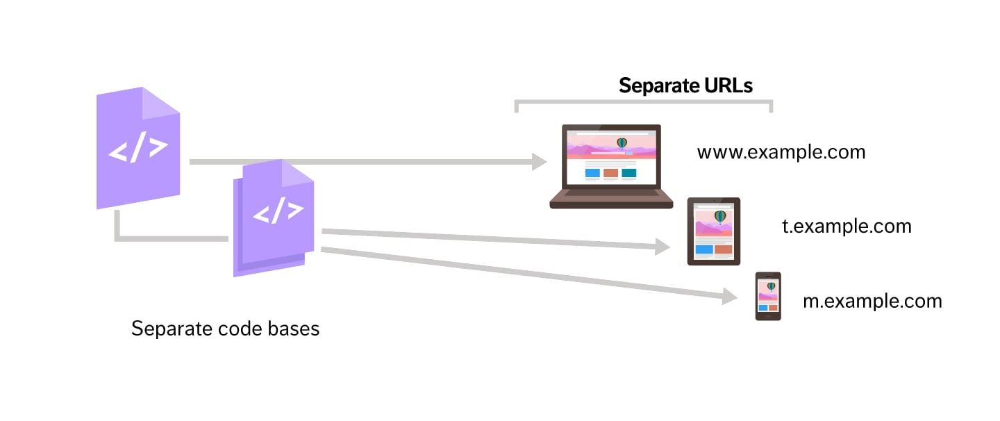
This approach is used to create a mobile-based alternative of each page of your website with separate HTML configurations. You can also specify your mobile website version by targeting it exclusively for smartphones (m.example.com) or tablets (t.example.com). Thus, the searchers will reach your website through being redirected to the code base containing the most appropriate layout for their devices, so the resulting page will be found under the corresponding URL.
The main disadvantage of this approach is a poor user experience which is caused by the excessive time needed to load a page from 3G served mobile devices. It is therefore unproductive to employ redirects for mobile SEO purposes, especially considering a mass success of RWD among web developers. However, you may consider separate mobile-based pages and redirects as a possible option in case if you lack sufficient knowledge or resources for building a competitive responsive website.
If you still deicide using separate URLs to adjust your website for mobile devices, Google suggests:
- adding bi-directional annotations on both desktop and mobile URLs of every page (<link rel=”alternate” href=”mobile”> for a desktop version, and <link rel=”alternate” href=”desktop”> for a mobile version);
- including the previously mentioned vary HTTP header to a page code.
Which of the three approaches will suit best for your business?
To answer this question, you should realize whether you expect to have more traffic on a mobile version of your website. This will depend on several factors:
- whether you provide correct redirects and annotations for every version of the website;
- whether your mobile site has the same keywords in its content as your desktop site ;
- whether Google is set to recognize that both versions of your website are identical.
There are cases, however, when a website owner aims his products or services specifically for mobile users. This requires him to provide more specific and original content to a mobile version of his website thus creating a difference in the content of the two versions. By putting more emphasis to a mobile version of your website, you can eventually make it a better traffic source than your original desktop site.
To determine which approach to implement in your particular case, you should first perform some traffic analysis. Specifically, you have to determine how much mobile traffic you get with only having a desktop version of your website. You can use Google Webmaster or Google Analytics to see which keywords bring you more traffic and thus define the most interesting topics of your potential audience.
Next, you should also consider the specifics of your business to better understand the needs of your customers. You can build an easy mobile access to the most relevant content of your website by using a server-side mobile optimization designed specifically for dynamic serving of various devices at the same time. For instance, if you own a hotel, it is likely that people would equally prefer visiting your website from desktop and from mobile, depending on their particular situation. In case with mobile, users will probably need your services right away, so the best way to keep them on your website is to provide your mobile layout with a minimum of text and a maximum of call-to-action content, such as contact details and prices.
Another case when you might want to use dynamic serving is when you provide online services which don’t require too much information for user to fill in. For instance, taxi service or pizza delivery websites are pretty easy to handle from both PC and smartphone. This means that your mobile layout will only differ from the original one by the size but not the content.
A separate mobile website is preferred when you offer services that require eye-to-eye business-customer interaction, like, for example, private hospitals or real estate agencies. In this case, your mobile website version should be as straightforward as possible for users to have no problems with seeing your prices and contacting your office if needed.
Finally, responsive web design is a must for those dealing with content-oriented websites, such as news blogs, online journals, or music services. The only thing you should do is to make sure that the key pages of your website are mobile-friendly enough to let users feel comfortable when browsing your website from smartphones or tablets.
Let search engines know you are mobile-friendly
Now when you chose and implemented one of the previously discussed approaches to adjust our website for mobile, it is time to make it work for your visibility in SERPs. Usually a website adapted for mobile devices will be granted next to their listing telling that the website is mobile-friendly. This label gives you a priority among other websites; more specifically, each time a user performs a mobile search, it is mobile-friendly labeled websites that will come first in the search results. We can conclude than that the mobile-friendly label has a direct influence on one’s rankings in mobile SERPs.
So, in order to make sure your website will get the label of mobile friendliness, you should satisfy the following conditions:
-
Your website has the meta viewport tag telling search bots that it’s mobile-friendly. Meta viewport tag is now a part of CSS Device Adaptation module which is still incomplete and therefore cannot be included in a formal standard. However, it is widely used by webmasters to communicate mobile browsers how to process and display the size and scale of a page on a particular device. To properly set up the viewport tag on your website, we recommend consulting Google’s provided with detailed descriptions and examples.
-
Your website has proper internal linking. This is the case with those having separate mobile websites linked to their desktop versions by corresponding redirects. It’s worth noting that any redirection should involve identical pages so that users were redirected to the same pages they initially searched for. For instance, if someone searches for your pricing page from their smartphone, you should provide them with desktop-to-mobile redirection to the equivalent mobile version of your pricing page and not to the website’s landing page. Check out on how to ensure your desktop-to-mobile redirects are set up properly.
-
You allowed search engine bots to crawl and index your media, JavaScript, and CSS files. There are cases when you can accidentally prevent search bots from crawling your website pages, which can eventually affect your overall rankings. Previously, many webmasters preferred to block these elements due to earlier versions of mobile devices not supporting them. This, however, has changed after technologies kept on evolving.
To check the ability of search engines to render and index your website, use Google’ official tool which can be found in . There you can also check your robots.txt file for potential errors and blocking elements.
-
Your on-site content is playable on mobile devices. There are content types which often cannot be played on smartphones and tablets, especially those based on Flash technology, including video players and animations. It is therefore recommended to avoid using Flash content in favour of HTML5 which is supported by all types of mobile devices. By doing so, you’re likely to get a better user experience on the mobile version of your website.
-
The mobile version of your website has a good page speed. It is essential to provide your mobile website version with a good loading speed, as it is one of the key factors contributing to higher rankings in mobile SERPs. Moreover, it is a crucial factor for mobile users themselves who are apt to utilize mobile search in order to find relevant information in the shortest time possible.
For more detailed information on managing your website speed, read of rules provided by the Google team. In addition, we advise using the tool to test the loading speed of every relevant page of your website.
-
The media content of your mobile website is optimized for a better page load time. This is especially the case if you deal with responsive design which requires having differently sized images for each version of your website. Each time you face the problem of a slow performance of your website from mobile, consider image optimization as the #1 strategy for improving your user experience. To find out the best technique for reducing the size of your images without losing their visual quality, follow on image optimization.
Having checked through all of the above conditions, you can then test your website’s mobile friendliness with a . Note, however, that those pages of your website that were not previously adapted for mobile devices will accordingly rank lower in mobile SERPs than those that did.
Overall, it takes around a few to 72 hours for Google to grant you a mobile-friendly label on condition that your website has met all of their official requirements.
Other handy mobile SEO tips
Although you may achieve significant success with a basic mobile SEO strategy for your website, there are some universal tips that apply to any kind of search engine optimization and thus are a worthy bonus to your online performance. Not only are these tips valuable in terms of your mobile marketing campaign, but they also provide an opportunity for better traffic and conversion results. Here is the list of the top 5 must-have extra tips for your mobile SEO strategy.
1. Perform a keyword research for your mobile website

As we have mentioned before, creating unique content for your mobile website is a must if you aim primarily at mobile users and expect them to take action fast and at any particular moment. This also applies to those who choose using dynamic serving or a separate mobile site as preferable solutions for their mobile optimization.
Because you need to create original and at the same time attractive content for your mobile site, you will have to perform a separate keyword analysis for it. Specifically, you will have to pay attention to those keywords that are likely to have more value to your mobile visitors. One of the key reasons for performing a keyword analysis is that around 70% of keywords you use for desktop will rank differently in mobile SERPs, so the main aim for you here is to define which of the keywords will rank higher on mobile than on desktop.
To perform a high-end keyword analysis, follow these simple steps:
-
Think of your mobile visitors’ primary needs. Getting the idea of what your visitors would expect to look for on your website from their mobile devices will significantly save your time and efforts on analyzing your keywords. Moreover, you will be able to more easily adapt your content for the target audience and thus make it look more attractive to them.
-
Think of what you would like your mobile audience to do on your website. Just as the previous step, this step is needed in order to help you figure out which particular action to encourage your mobile visitors for. It can be an offer to acquire membership, make an instant call, or to purchase something from your website. The main thing is to properly correlate your aims with user expectations.
-
Use to check the relevance of your keywords. As you might know, this is a very useful tool for determining the importance of various keywords for your website content. You can also use it to find out which of the keywords suit best for your mobile SEO campaign by choosing “Mobile Trends” option in your developer profile. You will then get a comprehensive graph showing the total number of mobile searches for a particular keyword for the period of the nearest month. The only drawback of this tool is the ability to check only one keyword at a time, but it’s still worth using.
-
Use to see which particular keywords are popular among your visitors the most. Particularly, go to Search Traffic category, choose Search Queries and filter all the search results to mobile ones.
-
Make your analysis results more accurate by using other alternative tools. One of the brightest options for a mobile keyword analysis is which allows you to look for the most appropriate keywords in terms of a general mobile search but also a specialized App Store search targeted specifically for mobile app owners.
2. Improve your titles and meta descriptions to attract more mobile visitors

This step considers improving not only the content of your titles and descriptions but also their form and length. In that way, you’re adjusting your SERPs listing to mobile device screens and mobile users themselves. However, the actual strategy will depend on which of the mobile SEO approaches you chose for your website. If you applied responsive design for the mobile site, than you will have to change the titles and meta descriptions on every page which, in some cases, can affect your PageRank on desktop, so make sure you find the right balance between your general SEO and mobile SEO goals. If you have a mobile website version with dynamic serving or a separate mobile website, you can change its content the way you like without being afraid of losing your SEO efficiency on the desktop version.
If talking about the perfect size of a title for mobile websites, it is generally agreed that the length of 45 characters is good enough for conveying your main idea and at the same time being perceivable by mobile users. As for the meta tag length, we recommend sticking to the limit of 90 characters, so make sure you put the most relevant keywords to your descriptions.
In case of Magento, you can install Amasty Meta Tags Templates.
3. Apply appropriate data markup to become more visible in mobile SERPs

Using structured data markup is required not only for general SEO purposes but also for mobile SEO as well. Basically, it is the most efficient way to annotate your content so that your website is both better indexed by search engines and approved of by mobile users. However, this step does not guarantee a 100% chance of getting to the top of the search results list, because it all eventually depends primarily on the quality of your website’s content rather than on how attractive it is from the visual point of view.
If you’re not sure how to handle data markup properly, check out that shows how to apply various types of markups depending on the particular type of on-site content you might have.
In case of Magento, you can use
4. Provide your mobile website with some local SEO features
This is a particularly important step to follow, as it gives you the priority of being more helpful to the visitors that need to reach you on the go. Moreover, adding location-specific information to your mobile website is likely to make it indexed higher in SERPs as well.
So, in order to settle things right, do the following:
- Register in and manage your profile. Filling in all the required fields is a must for achieving good results in local SEO. The final stage will be to verify your business information and thus become a true holder of your Google My Business profile. You can find more on how to manage and verify your company’s profile in by Google.
- Target your mobile website with a range of location-specific keywords, such as those related to your region, city, and district. Also check the relevance of each by performing a preliminary local search with “mobile” filter enabled.
- Make sure your NAP (Name-Address-Phone number) information is correct and consistent across all web sources, because this is what mobile users are likely to need when looking for the best business option for their current location.
- A “call us” button on the mobile version of your website is of utmost importance to those seeking for immediate assistance concerning your products or services, so it’s worth providing it.
For further information on Local SEO and Magento, check this guide: Local SEO Guide (Magento Tips Included)
5. Re-test your mobile website’s performance and get it indexed again

Instead of waiting hours and days for getting your site crawled by search engine bots, you can simply Google to do it right after you’re done with making changes to your mobile website. But don’t forget to perform an additional performance test first to ensure that you satisfy Google’s major mobile SEO terms and recommendations and is thus 100% eligible for the mobile-friendly label.
Optimizing mobile user experience

Now, when you have attained the rank of a mobile-friendly website and did everything you could to optimize it for search engine rankings, it is time to turn to mobile visitors themselves. Your next aim is to provide a competitive user experience that will not only bring you more traffic but also lead to higher conversion rates. Here you will need an assistance of a skillful web designer who will manage to find weaknesses on your website and turn them into valuable advantages. Thus, consider going through a few meaningful steps.
1. Start with improving the technical side of your mobile website
To begin with, you will need to take a closer look at the smallest elements of your website, as they might play an important role in forming mobile user behavior. Such elements can include:
- The content and length of URLs. Providing well-defined and clear descriptions to your links is a good way to inform visitors on the content of the page they intend to look at. Because we’re dealing with mobile SEO, it is crucial to make them brief to suit the screen of a mobile device.
- The distance between hyperlinks. Making links reasonably distant from one another will guarantee that a user won’t accidentally tap on the undesired link or button. This is often the case with mobile users having fat fingers.
- Apply legible fonts to the textual content. Consider the fact that your text will be read from smartphones and tablets having considerably smaller screens than desktop computers.
You can find more detailed recommendations on which font types and sizes to apply to your mobile website .
2. Protect your mobile site from unwanted visitors
By unwanted visitors we mostly mean malware bots that can access your website through both desktop and mobile, which is why it is recommended to employ CAPTCHA as a means of avoiding this problem. The downside of this approach, however, is that it can eventually lower the user experience you initially strived for, as it is highly inconvenient for a visitor to constantly re-enter CAPTCHA code just to have an access to your website’s page. While this can be more or less bearable for a desktop user, it is much more of a nightmare for a mobile user who is more likely to make errors while entering the code.
However, there are ways to keep your user experience high by still using CAPTCHA technology on your mobile site. The best possible option is to implement an image-based code instead of those based on letters and numbers. The idea behind an image-based CAPTCHA is that a user will only have to choose the images from the list that the most clearly describe the given description. If you decide to look for the most suitable options for your website, start with turning to Google’s official but keep in mind that there are other specialized companies that can offer their own image-based CAPTCHAs for you to use.
3. Simplify the sign-up process for mobile use
There is no reason to employ long sign-up forms for mobile visitors, as it significantly reduces the chances that they will continue with a website on seeing the scale of routine they will have to go through. It can also get worse because of the screen-size of a mobile device which makes it difficult for a person to enter too much text in various fields. So if you want to keep your mobile audience on the website and encourage them to sign up for a regular e-mail delivery or making a purchase, you will certainly have to adapt the sign-up process to meet the needs of mobile users.
To start with, you should visit your Google Analytics profile and check which of your website pages are most popular among mobile visitors. Based on the information you get, you can either create a mobile-optimized sign-up form for each mobile equivalent of your web page or optimize an existing form for a generally accepted mobile interface.
If you still need to implement long forms, there are efficient ways to compensate for its exceeding size. For instance, you can make use of an feature which is set to recognize the input information and fill it up for the user. Furthermore, you can enable social media integration on your website thus allowing users to sign up by using their Google or Facebook accounts.
4. Stay in touch with your customers with an on-site click-to-call feature
A high-end business-customer interaction is one of the key factors leading to stable sales and high conversion rates. To guarantee this interaction, you need to make it possible for your customers to contact you in case if:
- they have any questions concerning your products or services;
- making a call is a way to order your products or services (in case if you own a cafe, hotel, or pizza delivery service).
Providing your website with a convenient click-to-call button will not only simplify the interaction process between you and your customers, but it will also reinforce the power of individual approach as the core principle of every customer-centered business. It is essentially important for mobile as well, because around 70% of mobile users were to use click-to-call buttons from their smartphones and tablets.
Just as it was mentioned in the previous step, you need to only enable click-to-call buttons on the most relevant pages of your mobile site. Sometimes you can also think of creating a click-to-text button as a possible option for your particular business. You can read more on implementing click-to-call feature on your website on Google’s .
Social media integration is also important for spreading your content across the web. That is why you might be interested in providing social share features on your mobile site as well. Specifically, you should aim at the most relevant social networks, such as Facebook, Twitter, Pinterest, Google+, and LinkedIn. An attractive visual appearance of share buttons will also add up to your user experience.
6. Customize your website’s URL to make it more visible for mobile searchers
As you might have known, Google have recently introduced a allowing businesses to improve their visibility in mobile SERPs by changing the URL name of their main website page. In order to be eligible for this feature, you will need to meet a range of Google’s requirements, such as:
- Your new URL name should in many ways resemble your official domain’s name;
- Your new URL name should look like a natural name or a brand rather than an organization;
- Your new URL name should be unique and not copy any of already existing names;
- Your new URL name should clearly describe the essence of your website’s content.
As a result of this change, your website is likely to get more clicks and your brand – more awareness.
After you come up with the appropriate option for your website’s URL name, you should enable so-called on every page thus telling search engines that your website has a certain hierarchy of pages where one is a parent to another and vice versa. Including breadcrumb trails is performed by using the same structured data markup which you previously used for local SEO purposes. You can also consult the examples of proper markup in or on website specializing in all types of onsite markups.
App Store Optimization (ASO)
The highest point of mobile SEO today is a full-fledged mobile app that allows users to have a 24 hour online as well as offline access to your website’s content. If you create your personal mobile app, it will automatically acquire the status of an organic link in mobile SERPs and will keep on updating its PageRank in accordance with user popularity. Moreover, you don’t need to worry about how many users have installed your app, as your rankings will depend on the overall user activity on the app.
After Google has prioritized mobile-friendly websites in their ranking system, those of them having their own mobile app got an opportunity to have their search listings modified by a specialized install button allowing users to visit an app just from the search results page. In addition, Google offers a high-end (provided to both Android and iOS 9 operation systems) which enhances user engagement by allowing deep linking opportunities. Specifically, you can use which can encode the long version of your page’s URL into a short mobile-friendly link. By following such links, users will be directed to the page they were looking for instead of a simple homepage.
As you can see, there are large prospects for business owners in the field of mobile app SEO that can highly improve their online performance. That is where you might need to become aware of both mobile app SEO and, more specifically, App Store Optimization (ASO) techniques in order to move your mobile app ahead of your competitors. Due to certain peculiarities that are found in handling mobile app SEO if compared to general mobile SEO, we will share with you a typical mobile app optimization process.
1. Optimize while creating
Because mobile overwhelms all spheres of our daily routine, it’s no surprise that by now mobile app search became as popular as traditional one. MOZ based local study reveals that mobile users more often prefer to search for the content through a mobile app (such as Facebook or Twitter) rather than a web search.
If you want to also gain this priority among your mobile visitors, we advise you to follow these simple steps:
- When creating a mobile app, stick to your primary goals and make it look as an additional, or even another major, source of customer attraction.
- Your mobile app has to become a handy and even vital tool whose capabilities go beyond a desktop or mobile website.
- Keep in mind that dealing with a mobile app requires using completely different approaches to SEO, so you’ll need to gain sufficient skills to handle that.
Now we move to mobile app SEO itself:
- Simple as that: a proper app name. It would be evident to say that it should contain your company’s name and/or the name of your product. Also make use of at least two relevant keywords clearly describing your app. Remember that you deal with mobile, so your app name should be both brief and informative.
- Perform a keyword research. This universal step has to be applied here as well, but with a keyword search being performed either through App Store or Google Play (or both). As always, you should stick to the most relevant keywords for describing your app and its content which at the same time can be regarded as unique to the audience you strive for. You can check out on mobile app optimization and use the previously mentioned to enhance your results.
- Keep away from using interstitials on your website. No matter how much you would like to get visitors to install your awesome app, using interstitials all the way through your website’s browsing process is the worst possible option. If you care about user experience, you should be less obtrusive with your potential customers. So, instead of putting noisy pop-up advertisements right on the content which might be of interest to a visitor, you can present a modest call-to-action button at the bottom of the page so the visitor could be encouraged to download your app on their device rather than go back to search results looking for less irritating options.
- Index your newly created app for future rankings. It is especially the case with Android apps, as, according to , Android app indexing has acquired a ranking value in their SERPs. This means that users can now find your app as a separate listing in their search results list even if they don’t have your app installed. This, however, is not yet applicable to iOS apps.
You can find more about indexing your mobile app . And, after you’re done, you can also check the resulting performance of your app by using .
2. Optimize when done: ASO
Now, when you adjusted your mobile app to being more visible in SERPs, you can work on improving its presence in the actual app store. Note that the following steps are recommended primarily for Android-based apps.
- Create a relevant description for your app. While website descriptions should encourage users to visit the actual site, mobile app descriptions should get users to download and install the app. Most often, a good description will start with a strong statement about the main advantage of your product and its value for the user himself.
- Showcase your app with illustrative screenshots. This is important for demonstrating your app’s interface but also functional features to let visitors get the idea of how the app actually works.
- Include diverse keywords to your app’s description. Both App Store and Google Play allow you to include some keyword tags to your app’s profile. As for the former, you can use up to 100 characters for keyword tags. For some, this number can seem too small, so make sure you use not only the most relevant tags but also the most popular ones.
Conclusion
With these handy guidelines at hand, you are to enhance your presence among mobile users and eventually drive more conversions to your brand. Mobile SEO is thus not only about good rankings, but it is also about dominating your niche and the whole market as well.
Related posts
 How To Bulk Import Products In Shopify: CSV Description & Step-By-Step Guide
 A Complete Guide to Shopify Customer Import
 Magento 2 B2B Company Guide: Revealing Company Structure & Import
 Adobe (Magento 2) Commerce and Cloud (Enterprise Edition) Specific Features
 Shopware 6 Advanced Pricing Guide + Import Tutorial
 Reputon Amazon Importer Review: How to Connect Shopify to Amazon in a Few Clicks
 Amasty ChatGPT AI Content Generator for Magento 2
 Magento Open Source and Adobe Commerce 2.4.7 Release Notes