Guide to Good eCommerce Logo Design: How to Make Your Brand Memorable in 2025
A well-designed ecommerce logo is more than just a visual identifier — it’s the cornerstone of your brand’s identity and a critical tool for making a lasting impression. In the competitive landscape of online shopping, your logo is often the first thing customers notice. It communicates trust, reflects your brand’s personality, and plays a pivotal role in driving customer loyalty. Whether you’re launching a new store or rebranding an existing one, investing in thoughtful ecommerce logo design can set you apart from the crowd and leave a lasting impression.
This guide will walk you through the key aspects of creating a standout logo for your eCommerce website in 2025. From understanding the psychology of color and mastering minimalist trends to crafting designs that scale seamlessly across platforms, you’ll gain actionable insights to ensure your logo isn’t just attractive but also effective. Ready to create an eCommerce logo that not only looks great but also resonates with your audience? Let’s dive in!

Table of contents
- Why Your eCommerce Website Logo Is More Than Just a Pretty Picture
- How to Design a Perfect Logo for Your eCommerce Business
- Avoid the Pitfalls of Using Logo Generators: Why Creativity Counts
- The Role of Color Psychology in eCommerce Logo Design
- Creative eCommerce Logo Examples That Inspire and Convert
- eCommerce Logo Design Trends: What’s Hot Right Now
- Final Thoughts: Crafting a Memorable Logo That Stands the Test of Time
Why Your eCommerce Website Logo Is More Than Just a Pretty Picture
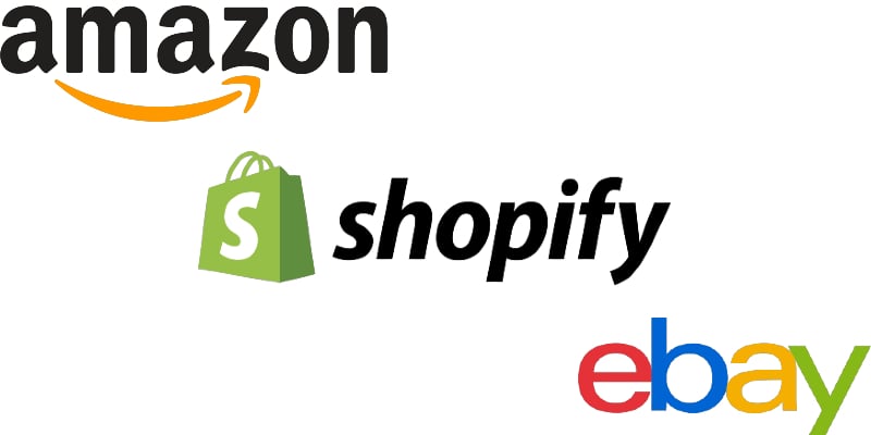
Let’s get one thing straight: your eCommerce logo isn’t just a decorative element — it’s the face of your brand. In the crowded online marketplace, where consumers make split-second decisions, a strong logo can differentiate between a fleeting glance and a loyal customer. When you think of Amazon, Shopify, or eBay, the logo is often the first thing that comes to mind. It’s not by chance; it’s by design.
A well-crafted ecommerce website logo does three key things:
- Builds Trust: Trust is the currency of eCommerce. Without a physical storefront or sales associate, your eCommerce logo is a major visual cue that helps establish credibility. A polished, professional logo gives customers confidence that your site is legitimate and your products are worth their time. On the flip side, a poorly designed or amateur logo can immediately raise red flags, causing potential customers to click away faster than you can say “free shipping.”
- Creates Brand Recognition: The online world is saturated with options. From niche boutiques to retail giants, standing out is tough. Your ecommerce logo is a visual shortcut that allows customers to recognize your brand at a glance, even before they read a single product description. Think about Shopify’s minimalist green bag icon — simple, distinctive, and instantly recognizable across devices. Your logo should do the same: cut through the noise and make a lasting impression.
- Drives Sales: Yes, your logo can directly impact sales. A memorable logo not only helps customers recall your brand but also reinforces positive associations over time. Research shows that people are more likely to buy from a brand they recognize and trust. Your logo is often the first step in building that trust. Whether it’s displayed on your homepage, email marketing, or product packaging, a cohesive and consistent eCommerce logo can subtly nudge potential buyers toward making a purchase.
Let’s dive deeper into some iconic eCommerce logos that are more than just eye-catching — they’re strategic assets that define their brands and help drive business growth. Each of these logos isn’t just a visual element; it’s a storytelling device that captures the brand’s essence in a single glance.
Amazon’s iconic smile logo is a masterclass in subtle branding. The arrow points from A to Z, symbolizing the vast range of products available, while the smile conveys customer satisfaction. It’s a small, clever design element that reflects the brand’s promise and sticks in your memory.
Shopify’s green shopping bag logo isn’t just an icon; it’s a visual representation of eCommerce itself. It’s clean, scalable, and works perfectly on both desktop and mobile. More importantly, it signals to users what the brand is about — helping businesses sell online. Shopify not only uses its logo to improve brand recognition but also adds a tiny slogan to all its websites. Read how to remove “Powerd by Shopify” in our guide.
How to Design a Perfect Logo for Your eCommerce Business
Designing an ecommerce logo that resonates — or asking someone to create one for your brand — isn’t just about looking good. It’s about creating a visual identity that reflects your brand’s values and connects with your audience. Whether you’re launching a new store or rebranding an existing one, these tips will guide you through the essentials of crafting a memorable logo for your eCommerce website or communicating with its future author.
1. Start With a Clear Brand Identity
Before you dive into design, take a step back and define your brand’s personality. Are you aiming for a sleek, modern vibe or a playful, friendly feel? Your logo is the face of your brand, so it should align with your tone and target audience. For example, a minimalist logo might suit a tech-focused eCommerce site, while a hand-drawn style could be perfect for an artisanal product line.
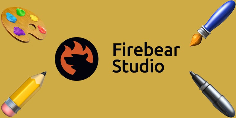
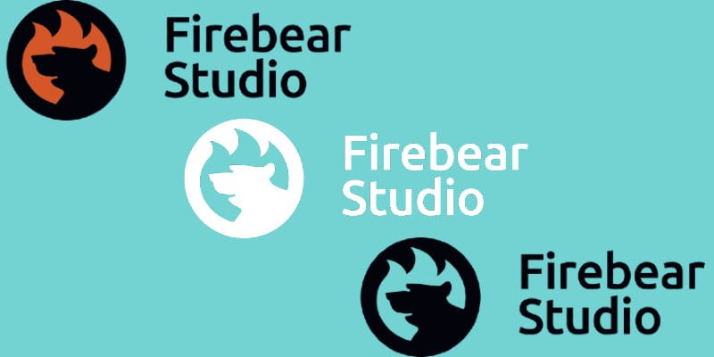
What does our logo say about us? It’s pretty straightforward: FireBear Studios is symbolized by a burning bear. But what does that really mean? The bear represents strength, resilience, and determination, while the fire embodies the passion and creativity that drive us. Together, they form a powerful symbol of our ability to ignite ideas and transform them into something extraordinary. While the imagery might remind some of an old joke, for us, it’s a bold statement about our commitment to innovation.

2. Choose Colors Wisely: It’s More Than Just Looks
Colors have a psychological impact on your customers. A well-thought-out color palette can communicate your brand’s message without a single word. Bold, vibrant colors like red and orange evoke energy and urgency, making them great for discount stores. In contrast, calm blues and greens convey trust and reliability, often used by eco-friendly brands. We will focus on the color psychology in ecommerce logos below.
Pro Tip: Ensure your color choices are versatile. Your eCommerce logo needs to look good in both full color and monochrome (think invoices, receipts, or black-and-white print). Just look at these three versions of our logo:
3. Pick the Right Font: Don’t Underestimate Typography
Typography can make or break your logo. It is generally accepted that serif fonts (like Times New Roman) convey tradition and reliability, while sans-serif fonts (like Helvetica) feel modern and clean. But in the fast-paced ecommerce world, both may look outdated or insufficient to represent your brand identity.
A script or handwritten font, however, can give a more personal, artisanal touch. Choose a font that matches your brand’s tone but keep legibility in mind — your logo for an ecommerce website should be easy to read at any size. That’s exactly what we did:

Avoid This Mistake: Don’t use overly decorative fonts that are hard to read or may appear outdated. Simplicity and clarity should be your guiding principles.
4. Keep It Simple: Less Is More
A good ecommerce logo needs to be recognizable in an instant. Think about the simplicity of logos from successful eCommerce brands like Allbirds. They don’t rely on complex designs or excessive details. Instead, they use clean lines and simple shapes that make the logo easy to remember. The key is to focus on a strong, singular concept rather than trying to cram in too many elements.
5. Design for Scalability: From Desktop to Mobile
In eCommerce, your logo needs to look good everywhere — on a desktop site, in a mobile app, and even as a tiny icon in the browser tab:
![]()
A well-designed eCommerce logo is scalable, meaning it retains its clarity and impact regardless of size. To achieve this, avoid intricate details and opt for a design that’s easy to simplify into smaller versions if needed. Consider creating a responsive logo — a variation of your main logo that’s optimized for smaller screens.
Pro Tip: Test your logo in different sizes and formats before finalizing the design. Ensure it’s legible and visually appealing even when scaled down.
6. Make It Timeless: Avoid Passing Trends
Trendy logos can be tempting, but they often look outdated within a few years. Aim for a timeless design that won’t need constant updating. Look at classic logos like Nike or Patagonia — they’ve remained largely unchanged for decades because their designs are simple, distinctive, and versatile. We don’t change our logo design either. Focus on creating an eCommerce logo that can grow with your brand and remain relevant as your business evolves.
7. Get Feedback and Iterate
Don’t finalize your ecommerce logo without getting feedback. Show your design to a variety of people — team members, loyal customers, or even friends. Pay attention to their reactions and gather input on what resonates and what doesn’t. Use this feedback to refine your eCommerce logo, making small adjustments that can enhance its appeal and effectiveness.
Avoid This Mistake: Don’t fall in love with a design just because you created it or you paid for it. Be open to feedback, and remember that your logo needs to resonate with your audience, not just you.
8. Test It Across Your Sales Channels
Once you have a final design, put it through its paces. Add it to your website header, product pages, social media profiles, and email templates. Does it fit seamlessly into your site’s design? Does it look good on different backgrounds? Testing your logo across various touchpoints ensures it’s versatile and effective in every context.
With these tips, you’re well on your way to designing a logo that stands out and stands the test of time. However, be aware of logo generators.
Avoid the Pitfalls of Using Logo Generators: Why Creativity Counts
Let’s be real: it’s tempting to use a free logo generator when you’re launching an eCommerce site. After all, they’re quick, easy, and inexpensive. But here’s the problem: logo generators rely on generic templates that lack the creative spark needed to make your ecommerce logo truly memorable. In a world where first impressions are everything, a cookie-cutter design can end up costing you more in the long run — lost customers, diluted brand identity, and a forgettable presence in a crowded market.
And that’s what happens when you ask AI to generate an ecommerce logo for your brand:

It’s not awful but it has nothing to do with the original logo. Let’s see why using logo generators and AI tools for crafting logos is not a bad idea.
The Risks of Automated Logo Tools
Automated logo generators, whether they use templates or AI, follow the same formulaic approach. They ask for a few inputs — your business name, industry, and preferred colors — and then churn out dozens of similar-looking options. But this process misses the essence of your brand. Your eCommerce logo isn’t just a random collection of shapes and text; it’s a visual representation of your business’s personality, values, and mission. A logo generator can’t capture that level of depth because it doesn’t know your story or your unique selling points.
Creative eCommerce Logos Make an Impact
A custom, thoughtfully designed creative ecommerce logo does more than just look pretty — it sets you apart from the competition. It tells a story, evokes an emotional response, and helps build trust with your audience. When customers see a unique logo, they’re more likely to perceive your business as professional, credible, and distinctive. In a digital landscape where you’re competing with countless other eCommerce websites, standing out is crucial.
The Real Cost of a Free Logo
Sure, logo generators might seem like a budget-friendly option, but they often end up costing you more in the long term. A poorly designed, generic logo can hurt your credibility and make customers question the quality of your products or services. Rebranding can be expensive, not just in terms of design costs but also in the time and effort needed to rebuild your brand identity across your eCommerce website, social media, and marketing materials.
Pro Tip: Invest in a professional designer who can create a logo tailored specifically to your business. It’s an upfront cost, but it’s a worthwhile investment that pays dividends in brand recognition and customer trust.
The Role of Color Psychology in eCommerce Logo Design
When it comes to designing an effective ecommerce logo, color isn’t just an aesthetic choice — it’s a strategic tool that influences how customers perceive your brand and even impacts their buying decisions. Color psychology, the study of how colors affect human emotions and behavior, plays a crucial role in logo design. Choosing the right colors can convey your brand’s personality, create an emotional connection, and make your logo more memorable. Let’s dive into how you can harness the power of color psychology to craft a creative ecommerce logo that resonates with your target audience.
The color palette you select for your logo should reflect your brand’s personality and appeal to your target audience. Here’s a breakdown of what different colors typically signify:
- Blue: Trust, reliability, and calmness. Blue is a favorite among eCommerce brands looking to establish credibility and a sense of security. It’s often used by tech companies (think PayPal) because it feels dependable and professional.
- Red: Energy, excitement, and passion. Red is a bold choice that grabs attention and can stimulate impulse purchases. It’s ideal for brands that want to evoke a sense of urgency or excitement, like Coca-Cola or Target.
- Green: Growth, health, and sustainability. Green is a natural fit for eco-friendly or wellness-focused brands. It evokes a sense of calm and balance, making it a great choice for companies that emphasize sustainability, like Allbirds or Whole Foods.
- Yellow: Optimism, warmth, and cheerfulness. Yellow exudes positivity and happiness, making it perfect for brands that want to create a friendly, approachable vibe. It’s often used by companies looking to appear youthful and energetic, such as Snapchat or IKEA.
- Black: Sophistication, luxury, and power. Black is a versatile choice that can convey elegance and high-end appeal. It’s commonly used in logos for luxury brands or minimalist designs, giving a sleek and polished look, like Nike or Chanel.
- Purple: Creativity, royalty, and wisdom. Purple can give your creative ecommerce logo a sense of imagination and luxury. It’s often associated with premium products and brands that want to appear unique and innovative, such as Cadbury or Hallmark.
- Orange: Playfulness, enthusiasm, and affordability. Orange is energetic and friendly, making it a good fit for eCommerce brands that want to appear fun and approachable. It’s a great choice for companies like Fanta or Harley-Davidson that want to convey excitement and creativity.
Use color combinations wisely. While a single color can communicate a strong message, combining colors can add depth and complexity to your ecommerce logo. A well-thought-out color scheme can help balance different brand attributes. For example:
- Blue and Green: Trust and sustainability — a good choice for eco-conscious tech brands.
- Red and Yellow: Energy and optimism — ideal for brands looking to create a sense of urgency and excitement.
- Black and Gold: Luxury and sophistication — perfect for high-end or premium eCommerce businesses.
The key is to choose complementary colors that align with your brand’s identity and appeal to your target market. Avoid using too many colors, as this can make your logo look cluttered and less professional. Stick to two or three colors for a clean, cohesive design.
However, you should not rely solely on design principles — test your color choices with your audience. Conduct A/B tests using different color palettes to see which one resonates best. You can also gather feedback through surveys, asking customers what emotions or impressions the colors in your eCommerce logo evoke. This data-driven approach can help you refine your design and choose colors that have the most positive impact.
Pro Tip: Be mindful of cultural differences in color perception. While red may symbolize luck in some cultures, it can represent danger in others. If you operate internationally, consider how your color choices might be interpreted across different regions.
Your logo’s color palette should be consistent across all branding elements, from your website and product packaging to your social media profiles. Consistency reinforces brand recognition and creates a cohesive visual experience for your customers. If your creative ecommerce logo uses a specific shade of blue, for example, make sure that the same blue appears throughout your site’s design, in buttons, banners, and icons.
Creative eCommerce Logo Examples That Inspire and Convert
A memorable creative eCommerce logo isn’t just a nice visual — it’s a powerful branding tool that communicates your company’s essence at a glance. The best eCommerce logos are instantly recognizable, effectively reflect the brand’s values, and leave a lasting impression on customers. In this section, we’ll showcase 10 standout logos from both popular brands and smaller niche players that have nailed their visual branding. Each example highlights unique design elements, such as clever use of negative space, bold color choices, or minimalist aesthetics, and explains why these logos resonate with their target audience.
Here’s a look at 10 creative eCommerce logos that can serve as inspiration for your own design journey:
| Brand Name | Description |
 |
The handwritten-style logo reflects Allbirds’ focus on comfort and natural materials, giving the brand an authentic, approachable feel. The clean lines and simplicity make it memorable and versatile across platforms. |
 |
The minimalist “G” logo of Glossier uses soft, rounded lines and a monochromatic palette, embodying the brand’s sleek, modern aesthetic. It appeals to beauty enthusiasts looking for simplicity and style. |
 |
Warby Parker’s typographic logo features a clean serif font that feels classic and sophisticated, aligning with the brand’s mission of offering stylish, quality eyewear at a fair price. The simplicity ensures legibility on all devices. |
 |
The friendly sans-serif typeface and crescent moon detail on the “C” subtly reference sleep, reflecting Casper’s focus on comfort and restfulness. The calming blue color reinforces the theme of relaxation. |
 |
Gymshark’s bold shark icon represents strength and performance, mirroring the brand’s focus on high-quality athletic wear. The sleek, streamlined design appeals to a fitness-focused audience looking for dynamic, energetic branding. |
 |
The Fjällräven logo features a stylized Arctic fox curled into a circular shape, symbolizing the brand’s name, which means “Arctic fox” in Swedish. Its minimalist design and warm red color convey a connection to nature, resilience, and the company’s dedication to outdoor exploration. |
 |
The iconic mountain silhouette logo captures Patagonia’s commitment to outdoor adventure and environmental sustainability. The natural, rugged design connects deeply with customers who share these values. |
 |
Away’s simple, typographic logo uses a sans-serif font that reflects the brand’s modern, no-frills approach to travel. The logo’s clean lines and spacing mirror the sleek design of the brand’s products. |
 |
The bold, dripping lip graphic in Kylie Cosmetics’ logo is glamorous and eye-catching, perfectly aligned with the brand’s bold, trendsetting image in the beauty industry. It’s instantly recognizable on packaging and social media. |
 |
The playful logo of BarkBox features a cartoonish font and a bone icon, capturing the brand’s fun, friendly approach to pet products. It appeals directly to pet owners looking for a lighthearted, joyful shopping experience. |
eCommerce Logo Design Trends: What’s Hot Right Now
So, what’s trending in the world of creative ecommerce logos right now? We’ve rounded up the hottest design styles that are dominating the ecommerce space. These trends go beyond surface-level aesthetics — they’re rooted in the psychology of branding and the shift toward mobile-first experiences. Let’s dive in:
- Minimalism and Clean Lines. Minimalism isn’t going anywhere. Simple, clean logos are always a breath of fresh air in a cluttered digital environment. Brands are stripping away unnecessary details, focusing on streamlined shapes and clean typography.
- Bold and Vibrant Colors. Gone are the days of muted, corporate blues and grays. eCommerce brands are embracing bold, vibrant colors that grab attention and create an emotional impact.
- Responsive Logos for Multi-Device Use. With mobile shopping on the rise, a one-size-fits-all logo doesn’t cut it anymore. Responsive logos are designed to adapt to various screen sizes and contexts. This trend involves creating multiple versions of a logo that scale seamlessly — from full-size logos for desktop websites to simplified icons for mobile apps and social media avatars.
- Animated Logos. Animation is making its way into eCommerce logos, adding a dynamic element that catches the eye. Subtle animations — like a logo that gently pulses or reveals itself with a swipe — can make your website feel more interactive and modern. Animated logos are particularly effective for digital-first brands.
- Retro and Vintage Aesthetics. Nostalgia sells, and many eCommerce brands are leaning into retro design trends to evoke a sense of familiarity and comfort. It’s a trend that works well for brands that want to emphasize authenticity, craftsmanship, or a throwback vibe.
- Negative Space and Clever Design Elements. The use of negative space — intentionally leaving parts of the logo blank to form hidden shapes or symbols — is a trend that never goes out of style. Clever use of negative space can add a layer of sophistication and make the logo more memorable. It’s a design trick that rewards the viewer for looking closer, creating a subtle “aha” moment that can make your creative ecommerce logo stand out.
- Gradient and 3D Effects. Gradients and 3D effects are making a comeback, adding depth and dimension to logo designs. This trend is especially popular among tech and lifestyle eCommerce brands. The smooth color transitions of gradients and the illusion of depth in 3D logos create a dynamic, visually appealing look that pops on screens.
- Experimental Typography: For brands looking to push the envelope, experimental typography is making waves. This trend breaks the traditional rules of logo design, using distorted, stretched, or deconstructed text to create a distinctive and edgy look. It’s about making a statement and grabbing attention with a design that feels unexpected and bold. This style works well for eCommerce brands in fashion, tech, and creative industries that want to convey innovation and risk-taking.
Final Thoughts: Crafting a Memorable Logo That Stands the Test of Time
Designing an ecommerce logo isn’t just about creating something that looks good today — it’s about building a visual identity that will resonate for years to come. Your logo is the face of your brand, appearing on everything from your website header to product packaging and social media posts. It’s one of the most important assets you’ll ever create, so it’s worth investing the time, thought, and resources to get it right. So don’t rush the process. Take the time to experiment, test, and refine your ideas until you land on a logo that truly captures the spirit of your brand.
If you’re ready to start designing, begin with a strong vision and a clear understanding of what makes your brand unique. And if you’re not confident in your design skills, don’t hesitate to consult a professional. The right designer can help you translate your brand’s story into a powerful visual symbol that stands the test of time.
Now, go create something iconic.
