TemplateMonster Film Slider Magento 2 Extension

We’ve already described several sliders for Magento 2, but there are still some extensions that are worth mentioning. For instance, there is one tiny tool in the TemplateMonster portfolio. Meet the Film Slider Magento 2 module – an easy-to-use a slider for your Magento 2 store.

Modules by TemplateMonster are no longer provided as stand-alone solutions, but you can still use the following replacements:
Table of contents
Swissuplabs Magento 2 Image Slider Extension
- great-looking slider to display and highlight particular content;
- a new tool for your promotion campaigns;
- customizable module configurations.

For further information, follow this link:
AheadWorks Rich Banner Slider Magento 2 Extension

- Unlimited number of slides;
- Unlimited number of banners;
- Automatic and manual slide rotation;
- Slide statistics.
Follow this link for further information:
Also, check Magento 2 Banner Slider Extensions Comparison. The original review of the TemplateMonster module is available below.
The extension is easy to install and use. It can be seamlessly integrated into every design and works well on any screen. Also note that the TemplateMonster Film Slider Magento 2 extension is developed with Magento 2 standards and requirements in mind, so it is a reliable solution that fits every e-commerce store.
The Magento 2 module provides the ability to set custom slider dimension and add eye-catching animation effects on a per-store basis. Besides, TemplateMonster Film Slider offers several types of navigation controls and supports multi-layer sliders. Let’s see how everything works under the hood.
Backend
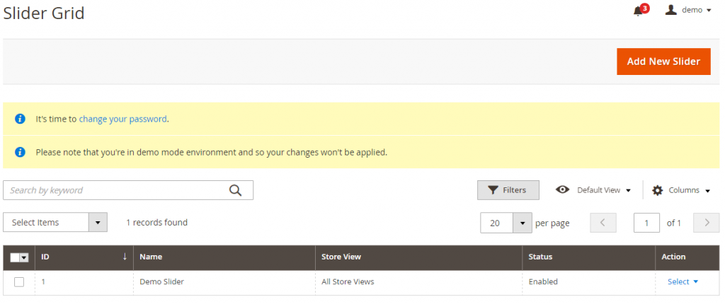
The backend section provides a slider grid that consists of the following columns:
- ID – an ID number of a slider;
- Name – a name of a slider;
- Store View – a store view where a slider is displayed;
- Status – enabled or disabled;
- Action – edit or delete sliders here.
As for mass actions, you can delete, enable, disable, or edit sliders in bulk. The last action provides the ability to change such parameters as name and status right on the grid.
While adding a new slider, you have to deal with two tabs: General Options and Slider Items. The first one is divided into 9 sections: Main settings, Image settings, Slider settings, Fade Animation settings, Auto Play settings, Controls settings, Responsive settings, Caption settings, and Layers Main settings.
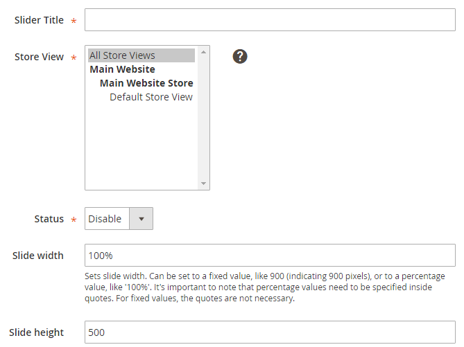
In the Main settings, specify slider title, select a store view, enable/disable the extension on the frontend, and specify slider width and height. You can use both fixed and percentage values. Note that percentage values should be entered within quotes.
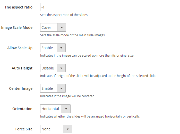
In the Image settings, specify the aspect ratio and choose values for the following parameters: Image Scale Mode (the scale mode of the main slide images), Allow Scale Up (whether the image can be scaled up more than its original size or not), Auto Height (whether the height of the slider is adjusted to the height of the selected slide), Center Image (whether the image is centered), Orientation (slides are arranged horizontally or vertically), and Force Size (the size of the slider is forced to full width or full window).
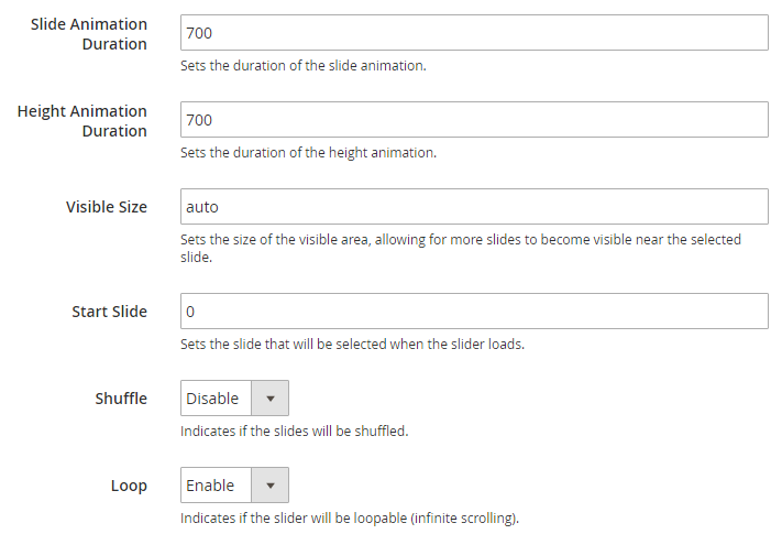
In the Slides settings, set the duration of both slide and height animations, the size of the area near the selected slide where more slides become visible, and the slide that is chosen when the slider loads. Besides, it is possible to enable/disable shuffle and loop effects.
As for the Fade Animation settings, you can enable/disable this feature, turn on the fade out effect for the previous slide, as well as set the fade duration.

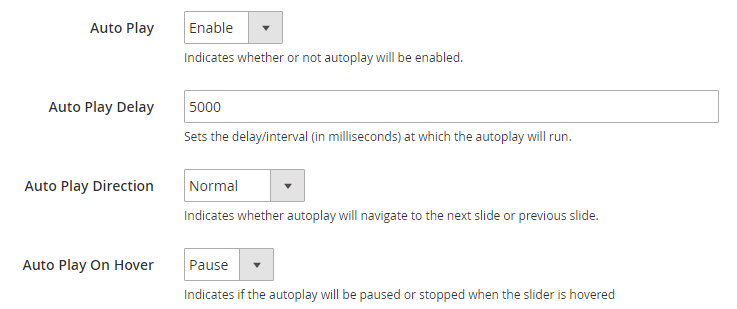
The AutoPlay settings provide the ability to enable/disable this functionality, set auto play delay time, select auto play direction, and specify the behavior of auto play on hover (pause, stop, or none).
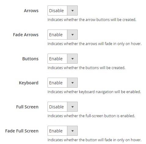
The Controls settings allow a user to enable/disable the following effects:
- Arrows – by enabling, you create the arrow button;
- Fade Arrows – arrows will fade in on hover;
- Buttons – by enabling, you create buttons;
- Keyboard – enable/disable keyboard navigation;
- Full Screen – enable/disable the full-screen button;
- Fade Full Screen – if enabled, the button will fade in only on hover.
The Responsive settings allow you to adjust the slider to various screen sizes. First of all, you enable the responsiveness and the touch swipe gestures. Next, set the touch swipe threshold. The last three options of this section allow specifying three screen sizes for small, medium, and large devices.
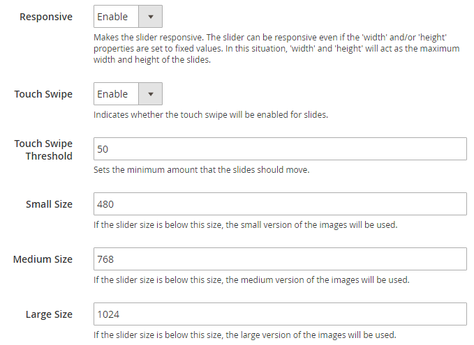
The Caption settings contain just two options: Fade Caption (enable/disable the feature) and Caption Fade Duration (sets the fade animation duration).

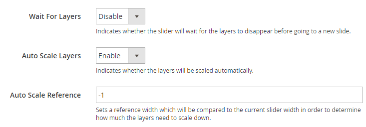
In the Layers main settings, enable/disable Wait For Layers to indicate whether the slider should wait for the layers to disappear before going to a new slide, enable/disable automated layers scaling, and sets a reference width – it is compared to the current slider width to determine the layers downscale.
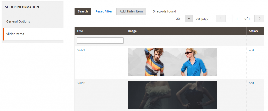
The Slider Items tab contains the grid with slides. You can view or edit each slide here.
It is also necessary to describe Slider Item Options. This tab appears when you edit a slide, and consists of the following sections: Slide Information, Slide Images, Layers List, Layer position settings, and Layer animation settings.
In Slide information, specify the name of the slide and enable it.

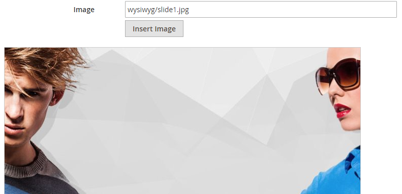
In Slide Images, you can upload a slide image and specify its preview width and height.
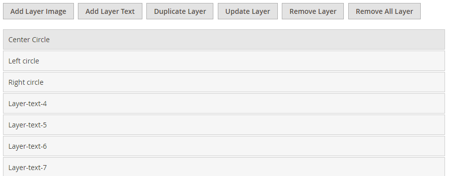
In Layers list, you can create image and text layers as well as change their positions.
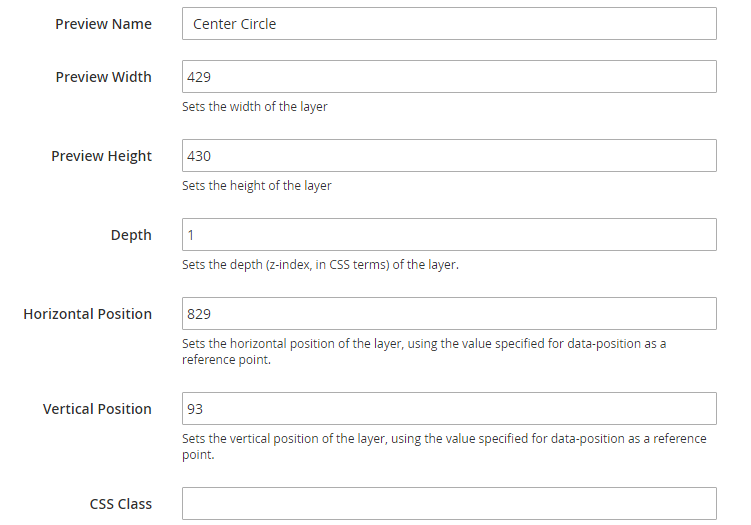
At the same time, there is the Layer position settings section that provides more options: Preview Name, Preview Width, Preview Height, Depth (of the layer), horizontal and vertical positions, as well as CSS Class.
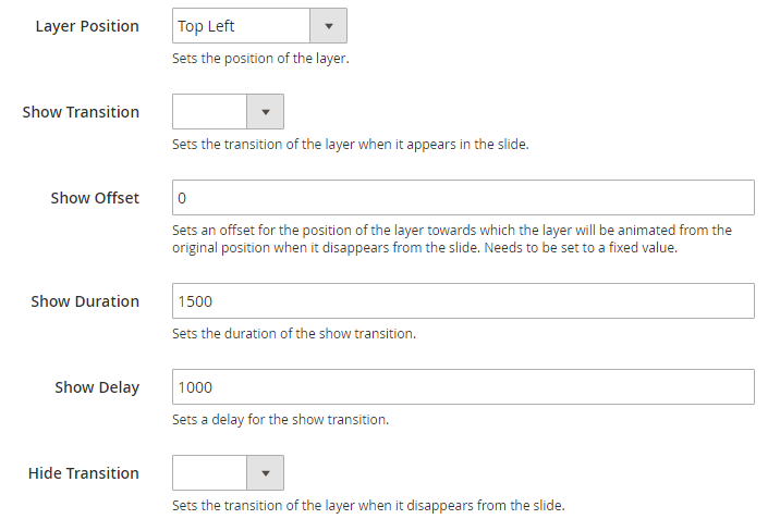
As for Layer animation settings, you select the layer position and specify transition, set an offset for the layer position towards which the layer is animated from the original position when it disappears, determine show duration and delay, hide transition and duration, hide offset and delay, as well as stay duration.
Frontend
From the perspective of a store visitor, the TemplateMonster Film Slider Magento 2 module has the following appearance:

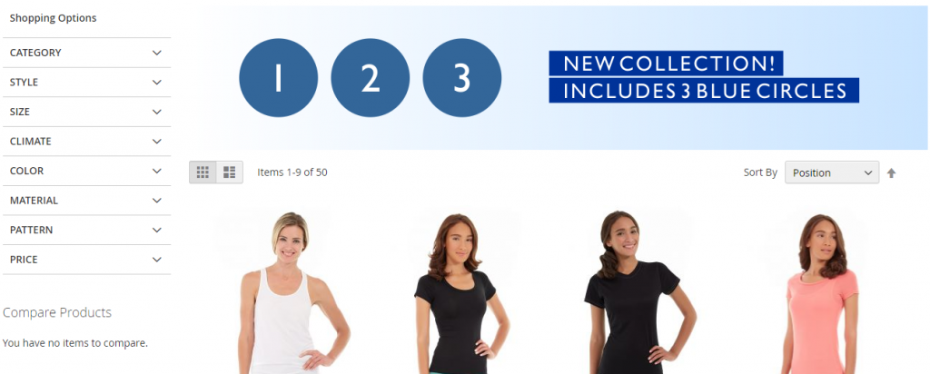
The slideshow is displayed in the top part of the page. It contains multiple layers that are fully configurable via backend. You can add texts, images, and buttons.
Final Words
As you can see, the TemplateMonster Film Slider Magento 2 extension is a complex solution that covers all possible aspects of e-commerce sliders. The module allows you to fine-tune the display of slides to make it suitable even for the most strict requirements. Consequently, you can attract the attention of the most demanding store visitors.
Unfortunately, it is not possible to add videos to the slider, but if you are going to create an image or text-based slideshows to promote your products, the module will be a perfect solution.
